Tables
A table presents data as a scrolling, single-column list of rows that can be divided into sections or groups. Use a table to display large or small amounts of information cleanly and efficiently in the form of a list. Generally speaking, tables are ideal for text-based content, and often appear as a means of navigation on one side of a split view, with related content shown on the opposite side. For guidance, see Split Views.
테이블은 데이터를 섹션 또는 그룹으로 나눌 수 있는 스크롤링된 단일 열 리스트로 표시합니다. 많은 양의 정보 또는 적은 양의 정보를 목록 형식으로 깔끔하고 효율적으로 표시하려면 표를 사용합니다. 일반적으로 표는 텍스트 기반 콘텐츠에 이상적이며, 종종 분할된 보기의 한쪽에서 탐색 수단으로 나타나고 관련 콘텐츠가 반대쪽에 표시됩니다. 자세한 내용은 뷰 분할을 참조하십시오.
iOS provides three styles of table: plain, grouped, and inset grouped.
iOS는 일반, 그룹화 및 삽입 그룹화의 세 가지 유형의 테이블을 제공합니다.
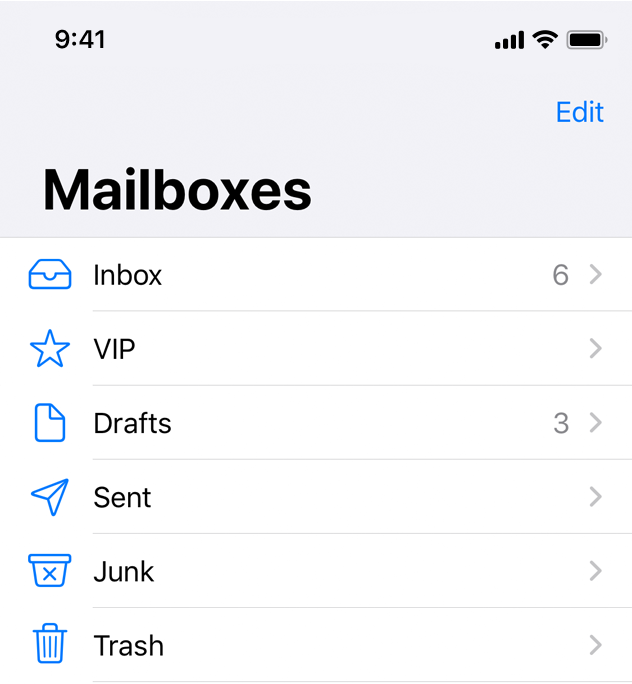
Plain. Rows can be separated into labeled sections, and an optional index can appear vertically along the right edge of the table. A header can appear before the first item in a section, and a footer can appear after the last item.
일반. 행을 레이블링된 섹션으로 구분할 수 있으며, 선택적 색인은 표의 오른쪽 가장자리를 따라 세로로 나타날 수 있습니다. 머리글은 섹션의 첫번째 항목 앞에 나타나고 바닥글은 마지막 항목 뒤에 나타날 수 있습니다.
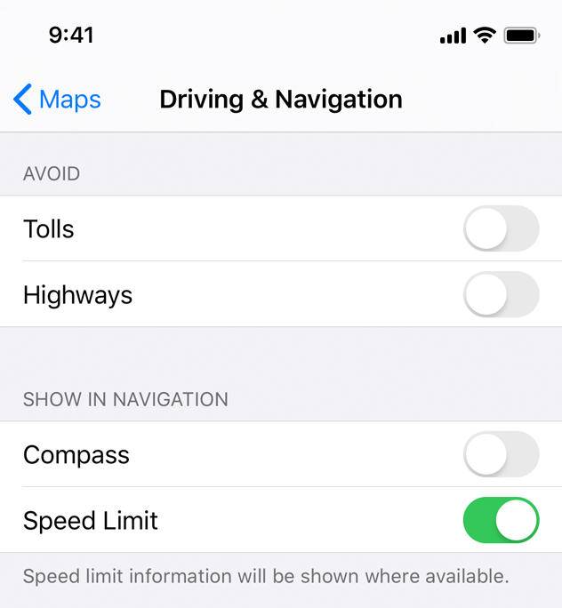
Grouped. Rows are displayed in groups, which can be preceded by a header and followed by a footer. This style of table always contains at least one group and each group always contains at least one row. A grouped table doesn’t include an index.
그룹입니다. 행은 그룹으로 표시되며, 그룹 앞에 머리글이 있고 그 뒤에 바닥글이 있을 수 있습니다. 이런 유형의 테이블에는 항상 하나 이상의 그룹이 들어 있으며 각 그룹에는 항상 하나 이상의 행이 들어 있습니다. 그룹화된 테이블에는 색인이 포함되지 않습니다.
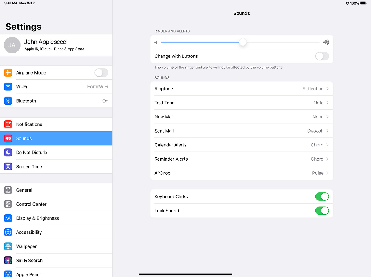
Inset grouped. Rows are displayed in groups that have rounded corners and are inset from the edges of the parent view (as shown on the right of the image above). This style of table always contains at least one group and each group always contains at least one row and can be preceded by a header and followed by a footer. An inset grouped table doesn’t include an index. The inset grouped style works best in a regular width environment. Because there's less space in a compact environment, an inset grouped table can cause text wrapping, especially when content is localized.
그룹화된 삽입입니다. 행은 모서리가 둥글고 상위 뷰의 모서리에서 삽입된 그룹으로 표시됩니다(위 이미지 오른쪽 참조). 이러한 유형의 테이블에는 항상 하나 이상의 그룹이 포함되어 있으며 각 그룹에는 항상 하나 이상의 행이 포함되어 있으며 머리글 앞과 바닥글 뒤에 올 수 있습니다. 그룹화된 삽입 테이블에는 색인이 없습니다. 삽입물 그룹 스타일은 규칙 너비 환경에서 가장 잘 작동합니다. 컴팩트 환경에서는 공간이 더 적기 때문에, 특히 콘텐츠가 지역화된 경우 삽입된 테이블은 텍스트 줄바꿈을 유발할 수 있습니다.
Think about table width. Thin tables can cause truncation and wrapping, making them hard to read and scan quickly at a distance. Wide tables can also be difficult to read and scan, and can take away space from content.
테이블 너비를 생각해보세요. 얇은 테이블은 잘라내기와 래핑의 원인이 되어 멀리서 빠르게 읽고 스캔하기 어렵게 만들 수 있습니다. 넓은 테이블은 또한 읽고 스캔하기 어려울 수 있으며 콘텐츠의 공간을 빼앗을 수 있습니다.
Begin showing table content quickly. Don’t wait for extensive table content to load before showing something. Fill onscreen rows with textual data immediately and show more complex data—such as images—as it becomes available. This technique gives people useful information right away and increases the perceived responsiveness of your app. In some cases, showing stale, older data may make sense until fresh, new data arrives.
표 내용을 빨리 보여주기 시작합니다. 무언가를 보여주기 전에 광범위한 테이블 콘텐츠가 로드될 때까지 기다리지 마십시오. 텍스트 데이터로 화면 행을 즉시 채우고, 이미지와 같은 보다 복잡한 데이터를 사용할 수 있게 되면 표시합니다. 이 기술은 사람들에게 유용한 정보를 즉시 제공하고 당신의 앱의 인식된 반응성을 높입니다. 경우에 따라 새 데이터가 도착할 때까지 먼저 도착한 데이터를 먼저 보여주는 것이 적절합니다.
Communicate progress as content loads. If a table’s data takes time to load, show a progress bar or spinning activity indicator to reassure people that your app is still running.
컨텐츠 로드 시 진행 상황을 전달합니다. 테이블의 데이터를 로드하는 데 시간이 걸리는 경우 진행률 표시줄이나 회전 활동 표시기를 표시하여 앱이 계속 실행 중임을 다른 사람에게 확인시켜 줍니다.
Keep content fresh. Consider updating your table’s content regularly to reflect newer data. Just don’t change the scrolling position. Instead, add the content to the beginning or end of the table, and let people scroll to it when they’re ready. Some apps display an indicator when new data has been added, and provide a control for jumping right to it. It’s also a good idea to include a refresh control, so people can manually perform an update at any time. See Refresh Content Controls.
콘텐츠를 신선하게 유지합니다. 새로운 데이터를 반영하기 위해 테이블의 내용을 정기적으로 업데이트하는 것을 고려해 보십시오. 스크롤 위치만 바꾸지 마세요. 대신 테이블의 시작이나 끝에 내용을 추가하고, 사용자가 준비가 되면 스크롤할 수 있도록 하십시오. 일부 앱은 새 데이터가 추가되면 indicater를 보여주고 바로 이동할 수 있는 제어 기능을 제공합니다. 또한 사용자가 언제든지 수동으로 업데이트를 수행할 수 있도록 새로 고침 컨트롤을 포함하는 것이 좋습니다. 내용 컨트롤 새로 고침을 참조하십시오.
Avoid combining an index with table rows containing right-aligned elements. An index is controlled by performing large swiping gestures. If other interactive elements reside nearby, such as disclosure indicators, it may be difficult to discern the user’s intent when a gesture occurs and the wrong element may be activated.
인덱스를 오른쪽으로 정렬된 요소가 포함된 테이블 행과 결합하지 않도록 합니다. 인덱스는 큰 스와핑 제스처를 수행하여 제어됩니다. 노출 표시기와 같은 다른 대화형 요소가 근처에 있는 경우 제스처가 발생할 때 사용자의 의도를 식별하기 어렵고 잘못된 요소가 활성화될 수 있습니다.
For developer guidance, see UITableView.
Table Rows
You use standard table cell styles to define how content appears in table rows.
개발자 지침은 UITableView를 참조하십시오.
테이블 행
표준 표 셀 스타일을 사용하여 내용이 표 행에 표시되는 방법을 정의합니다.
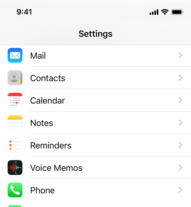
Basic (Default). An optional image on the left side of the row, followed by a left-aligned title. It’s a good option for displaying items that don’t require supplementary information. For developer guidance, see the UITableViewCellStyleDefault constant of UITableViewCell.
기본(기본값)입니다. 행 왼쪽에 옵션 이미지가 있고 그 뒤에 왼쪽에 정렬된 제목이 있습니다. 이것은 추가 정보가 필요하지 않은 항목을 표시할 때 좋은 옵션입니다. 개발자 지침은 UITableViewCell의 UITableViewStyleDefault 상수를 참조하십시오.
Subtitle. A left-aligned title on one line and a left-aligned subtitle on the next. This style works well in a table where rows are visually similar. The additional subtitle helps distinguish rows from one another. For developer guidance, see the UITableViewCellStyleSubtitle constant of UITableViewCell.
자막이요. 한 줄에는 왼쪽 정렬 제목이, 다음 줄에는 왼쪽 정렬 부제가 있습니다. 이 스타일은 행이 시각적으로 유사한 테이블에서 잘 작동합니다. 추가 부제는 행을 서로 구별하는 데 도움이 됩니다. 개발자 지침은 UITableViewCell의 UITableViewStyleSubtitle 상수를 참조하십시오.
Right Detail (Value 1). A left-aligned title with a right-aligned subtitle on the same line. For developer guidance, see the UITableViewCellStyleValue1 constant of UITableViewCell.
오른쪽 세부 정보(값 1)입니다. 같은 줄에 오른쪽 정렬 부제가 있는 왼쪽 정렬 제목입니다. 개발자 지침은 UITableViewCell의 UITableViewStyleValue1 상수를 참조하십시오.
Left Detail (Value 2). A right-aligned title, followed by a left-aligned subtitle on the same line. For developer guidance, see UITableViewCellStyleValue2 constant of UITableViewCell.
왼쪽 상세(값 2)입니다. 같은 줄에 오른쪽 정렬된 제목과 왼쪽 정렬된 부제입니다. 개발자 지침은 UITableViewCell의 UITableViewStyleValue2 상수를 참조하십시오.
All standard table cell styles also allow graphical elements, such as a checkmark or disclosure indicator. Of course, adding these elements decreases the space available for titles and subtitles.
모든 표준 테이블 셀 스타일에서는 확인 표시 또는 노출 표시기와 같은 그래픽 요소도 사용할 수 있습니다. 물론 이러한 요소를 추가하면 제목과 자막을 저장할 수 있는 공간이 줄어듭니다.
Keep text succinct to avoid clipping. Truncated words and phrases are hard to scan and decipher. Text truncation is automatic in all table cell styles, but it can present more or less of a problem depending on which cell style you use and where truncation occurs.
클리핑을 피하기 위해 텍스트를 간결하게 유지합니다. 잘린 단어와 구문은 스캔하고 해독하기 어렵습니다. 텍스트 잘라내기는 모든 표 셀 유형에서 자동으로 수행되지만, 사용하는 셀 스타일과 잘리는 위치에 따라 문제가 다소 발생할 수 있습니다.
Consider using a custom title for a Delete button. If a row supports deletion and it helps provide clarity, replace the system-provided Delete title with a custom title.
삭제 버튼에 사용자 정의 제목을 사용하는 것을 고려해 보십시오. 행이 삭제를 지원하고 명확성을 제공하는 데 도움이 되면 시스템에서 제공한 삭제 제목을 사용자 정의 제목으로 바꿉니다.
Provide feedback when a selection is made. People expect a row to highlight briefly when its content is tapped. Then, people expect a new view to appear or something to change, such as a checkmark appearing, that indicates a selection has been made.
선택 시 피드백을 제공합니다. 사람들은 행의 내용을 누르면 행이 잠깐 강조 표시되기를 기대합니다. 그런 다음, 사용자는 새 보기가 나타나거나 선택되었음을 나타내는 확인 표시가 나타나는 등의 변경사항이 나타날 것으로 예상합니다.
Design a custom table cell style for nonstandard table rows. Standard styles are great for use in a variety of common scenarios, but some content or your overall app design may call for a heavily customized table appearance. To learn how to create your own cells, see Customizing Cells in Table View Programming Guide for iOS.
비표준 표 행에 대한 사용자 정의 표 셀 스타일을 설계합니다. 표준 스타일은 다양한 일반적인 시나리오에서 사용하기에 적합하지만, 일부 컨텐츠 또는 전체 앱 설계는 사용자 정의된 테이블 모양을 필요로 할 수 있습니다. 셀을 직접 만드는 방법은 iOS용 테이블 보기 프로그래밍 가이드의 셀 사용자 정의를 참조하십시오.
For developer guidance, see UITableViewCell.
※ 참고 출처
Tables - Views - iOS - Human Interface Guidelines - Apple Developer
Tables A table presents data as a scrolling, single-column list of rows that can be divided into sections or groups. Use a table to display large or small amounts of information cleanly and efficiently in the form of a list. Generally speaking, tables are
developer.apple.com
'HIG' 카테고리의 다른 글
| [iOS / HIG] Loading (0) | 2022.02.19 |
|---|---|
| [iOS / HIG] Text Fields (0) | 2022.02.05 |
| [iOS / HIG] Image Views (0) | 2022.02.05 |
| [iOS / HIG] Collections (0) | 2022.02.05 |
| [iOS / HIG] Tab Bars (0) | 2022.02.05 |