Buttons
The system offers a range of button styles that support extensive customization while providing built-in interaction states, accessibility support, and appearance adaptation. In addition, there are several system-defined button types — such as toggle, pop-up, and pull-down — that support a variety of specific use cases.
이 시스템은 광범위한 사용자 정의를 지원하는 다양한 버튼 스타일을 제공하는 동시에 내장된 상호 작용 상태, 접근성 지원 및 모양 적응 기능을 제공합니다. 또한 다양한 특정 사용 사례를 지원하는 토글, 팝업 및 풀다운과 같은 여러 시스템 정의 버튼 유형이 있습니다.
For developer guidance, see UIButton (UIKit) and Button (SwiftUI).
개발자 지침은 UIKit(UIButton) 및 버튼(Swift)을 참조하십시오.UI)를 클릭합니다.
The system defines four button styles, each available in three sizes. Each style has a different level of visual prominence, helping you communicate a hierarchy of actions within your app.
시스템은 네 가지 버튼 스타일을 정의하며, 각각 세 가지 크기로 사용할 수 있습니다. 각 스타일은 서로 다른 수준의 시각적 두드러기를 가지고 있어 앱 내에서 작업 계층을 전달하는 데 도움이 됩니다.
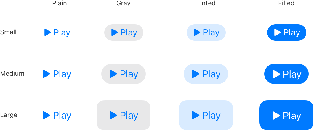
오른쪽을 가리키는 삼각형과 Play라는 단어가 포함된 시스템 단추의 가능한 크기와 스타일 조합 12가지 매트릭스를 보여주는 다이어그램입니다. 행렬의 행은 작음, 중간 및 큰 크기를 나타내고, 열은 일반, 회색, 색조 및 채우기 스타일을 나타냅니다.
You can configure a system button to use any combination of style and size. By default, a system button uses a size-specific corner radius and your app’s tint color. If necessary, you can change these attributes — in addition to attributes that control content layout and the presence of an activity indicator — in your button configuration. For developer guidance, see UIButton.Configuration.
스타일과 크기의 조합을 사용하도록 시스템 버튼을 구성할 수 있습니다. 기본적으로 시스템 버튼은 크기별 둥그런 모서리과 앱의 틴트 색상을 사용합니다. 필요한 경우, 단추 환경설정에서 내용 레이아웃 및 활동 표시기의 존재를 제어하는 속성뿐만 아니라 이러한 속성을 변경할 수 있습니다. 개발자 지침은 UIButton.Configuration을 참조하십시오.
Create button content that helps people instantly understand what the button does. You can use a glyph (or icon), a title, or both to communicate a button’s purpose. If a glyph makes sense in your button, consider using an existing or customized SF symbol (for guidance, see SF Symbols). To use text, create a short title that succinctly describes what the button does. Use title-style capitalization and a title that starts with a verb to help convey the button’s action — for example, a button that lets people add items to their shopping cart might use the title “Add to Cart.”
버튼의 기능을 즉시 이해할 수 있는 버튼 콘텐츠를 만드세요. 문자(또는 아이콘), 제목 또는 둘 다 사용하여 단추의 목적을 전달할 수 있습니다. 단추에 글리프가 적합한 경우 기존 또는 사용자 정의된 SF 기호를 사용하는 것을 고려하십시오(지침은 SF 기호 참조). 텍스트를 사용하려면 단추의 기능을 간결하게 설명하는 짧은 제목을 작성합니다. 예를 들어, 장바구니에 항목을 추가할 수 있는 단추는 "장바구니에 추가"라는 제목을 사용할 수 있습니다.
Include a subtitle if it provides useful details. A button can display a subtitle below its title. Because the subtitle uses a smaller text size than the title, it works well to communicate secondary information related the button’s action. For example, you might use the subtitle to update an “Add to Cart” button with the number of items in the cart. Avoid using a subtitle to explain more about what the button does; a button’s containing view, title, and image should provide all the information people need to understand its action.
유용한 세부 정보를 제공하는 경우 부제를 포함합니다. 단추는 제목 아래에 부제를 표시할 수 있습니다. 부제는 제목보다 작은 텍스트 크기를 사용하기 때문에 단추의 동작과 관련된 보조 정보를 전달하는 데 적합합니다. 예를 들어, 부제를 사용하여 카트에 있는 항목 수로 "카트에 추가" 버튼을 업데이트할 수 있습니다. 단추는 보기, 제목 및 이미지를 포함하므로 단추의 작업을 이해하는 데 필요한 모든 정보를 제공할 수 있으므로 단추의 기능을 자세히 설명하려면 부제를 사용하지 않도록 합니다.
Configure a button to display an activity indicator when you need to provide feedback about an action that doesn’t instantly complete. Displaying an activity indicator within a button can save space in your UI, while clearly communicating the reason for the delay. If it helps clarify what’s happening, you can also configure the button to display a different label alongside the activity indicator. For example, the label “Checkout” could change to “Checking out...” while the activity indicator is visible. When a delay occurs after people tap your configured button, the system displays the activity indicator next to the original or alternative label, hiding the button image, if there is one. For developer guidance, see showsActivityIndicator.
즉시 완료되지 않은 작업에 대한 피드백을 제공해야 할 때 활동 표시기를 표시하도록 단추를 구성합니다. 버튼 내에 활동 표시기를 표시하면 UI의 공간을 절약하는 동시에 지연 이유를 명확하게 전달할 수 있습니다. 작업 표시기와 함께 다른 레이블을 표시하도록 단추를 구성할 수도 있습니다. 예를 들어, 활동 표시기가 표시되는 동안 "체크아웃" 레이블이 "체크아웃..."으로 변경될 수 있습니다. 사용자가 구성한 버튼을 누른 후 지연이 발생하면, 시스템은 활동 표시기를 원래 레이블 또는 대체 레이블 옆에 표시하고 버튼 이미지가 있는 경우 숨깁니다. 개발자 지침은 showActivity를 참조하십시오.지표입니다.
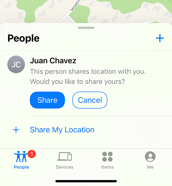
내 앱 찾기에서 사용자 탭의 일부 스크린샷입니다. 사용자 시트는 동일한 크기의 두 개의 단추를 사용하여 다른 사용자와 위치를 공유하거나 취소할 수 있는 선택사항을 제공합니다. 공유 단추는 파란색 채우기를 흰색 텍스트로 사용하고 취소 단추는 파란색 윤곽선, 채우기 없음 및 파란색 텍스트를 사용합니다.
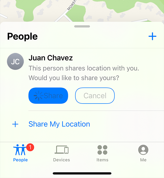
내 찾기 앱의 사용자 탭의 부분 스크린샷으로, 공유 버튼을 누른 후 발생하는 상태를 보여줍니다. 공유 단추는 파란색 채우기를 유지하지만 텍스트 색상을 흰색에서 회색으로 변경하고 선행 모서리 안에 회전 활동 표시기를 표시합니다. 취소 단추는 파란색 윤곽선을 계속 사용하고 채우기를 하지 않지만 텍스트 색상을 파란색에서 회색으로 변경합니다.
Use a filled button for the most likely action in a view. The filled style is the most visually prominent, so it helps people quickly identify the action they’re most likely to want. At the same time, avoid using too many filled buttons in a view. Too many filled buttons can increase cognitive load because people must spend time comparing multiple likely options before making a choice.
보기에서 가장 가능성이 높은 작업을 수행하려면 채워진 단추를 사용합니다. 채워진 스타일은 시각적으로 가장 두드러지기 때문에 사람들이 가장 원할 것 같은 동작을 빠르게 식별할 수 있도록 도와줍니다. 또한 보기에 너무 많은 단추를 사용하지 않도록 합니다. 버튼을 너무 많이 채우면 사람들이 선택하기 전에 여러 가지 가능한 옵션을 비교하는 데 시간을 소비해야 하기 때문에 인지 부하가 증가할 수 있습니다.
Use style — not size — to visually distinguish the preferred choice among multiple options. When you use buttons of the same size to offer two or more options, you signal that the options form a coherent set of choices. If you want to highlight the preferred or most likely option in a set, use a more prominent button style for that option and a less prominent style for the remaining ones.
크기가 아닌 스타일을 사용하여 여러 옵션 중에서 선호하는 항목을 시각적으로 구분합니다. 동일한 크기의 단추를 사용하여 두 개 이상의 옵션을 제공하면 옵션이 일관된 선택 집합을 형성한다는 신호를 보냅니다. 세트에서 선호되거나 가능성이 가장 높은 선택사항을 강조 표시하려면 해당 선택사항에는 더 두드러지는 단추 스타일을 사용하고 나머지 선택사항에는 덜 두드러지는 스타일을 사용하십시오.
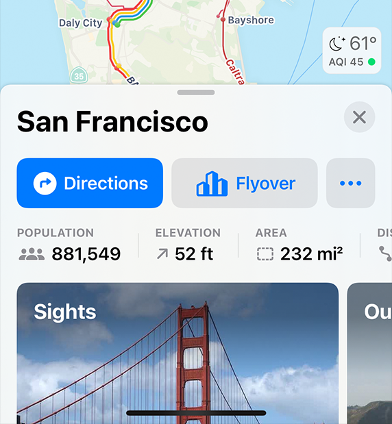
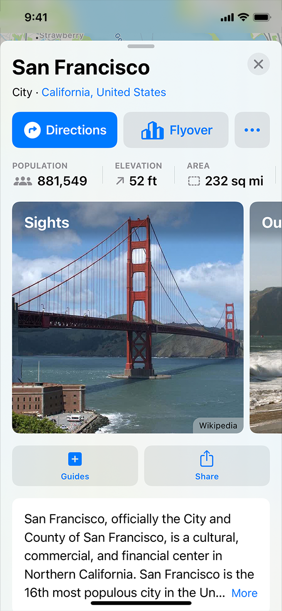
현재 위치에 대한 세부 정보를 보여주는 지도 시트의 일부 스크린샷입니다. 시트에는 동일한 크기의 버튼 두 개가 표시됩니다. 하나는 방향이고 다른 하나는 저공비행입니다. 길찾기 버튼은 파란색 채우기를 사용하여 가장 가능성이 높은 옵션임을 나타내고, 플라이오버 버튼은 회색 채우기를 사용하여 덜 가능성이 있는 옵션임을 나타냅니다.
시트에는 동일한 크기의 버튼 두 개가 표시됩니다. 하나는 방향이고 다른 하나는 저공비행입니다. 길찾기 버튼은 파란색 채우기를 사용하여 가장 가능성이 높은 옵션임을 나타내고, 플라이오버 버튼은 회색 채우기를 사용하여 덜 가능성이 있는 옵션임을 나타냅니다.
A system button can also have a role, which identifies the button’s semantic meaning within your app. A button can have one of the following roles:
- Normal. No specific meaning.
- Primary. The button is the default button — that is, the button people are most likely to choose.
- Cancel. The button cancels the current action.
- Destructive. The button performs an action that can result in data destruction.
시스템 버튼에는 앱 내에서 버튼의 의미론적 의미를 식별하는 역할도 있을 수 있습니다. 버튼은 다음 역할 중 하나를 가질 수 있습니다.
- Normal. 특별한 의미는 없어요
- Primary. 기본적인 단추는 기본 버튼입니다. 즉, 사용자가 가장 선택하기 쉬운 단추입니다.
- Cancel. 단추가 현재 작업을 취소합니다.
- Destructive. 버튼은 데이터를 파괴할 수 있는 작업을 수행합니다.
A button’s role can have additional effects on the appearance you configure. For example, the system uses bold text for the title in a primary button, whereas a destructive button includes a red color. For developer guidance, see UIButton.Role (UIKit) and role (SwiftUI).
단추의 역할은 사용자가 구성하는 모양에 추가적인 영향을 미칠 수 있습니다. 예를 들어, 시스템은 기본 단추의 제목에 굵은 텍스트를 사용하는 반면, 파괴 단추에는 빨간색이 포함됩니다. 개발자 지침은 UIButton을 참조하십시오.역할(UIKit)과 역할(Swift)이 있습니다.UI)를 클릭합니다.
Assign the primary role to the button people are most likely to choose. A primary button should respond to the Return key, making it easy for people to quickly confirm their choice. In addition, when the button is in a temporary view — such as a sheet, an editing view, or an alert — assigning it the primary role means that the view can automatically close when people choose Return.
사람들이 가장 선택하기 쉬운 버튼에 우선순위 역할을 지정합니다. 기본 버튼은 Return 키에 응답하여 사용자가 쉽게 선택 항목을 확인할 수 있도록 합니다. 또한 단추가 시트, 편집 보기 또는 알림과 같은 임시 보기에 있을 때 기본 역할을 할당하면 사용자가 돌아가기를 선택할 때 자동으로 보기가 닫힐 수 있습니다.
Don’t assign the primary role to a button that performs a destructive action, even if that action is the most likely choice. Because of its visual prominence, people sometimes choose a primary button without reading it first. Help people avoid losing content by assigning the primary role to nondestructive buttons.
제거 작업을 수행하는 단추에는 기본 역할을 할당하지 마십시오. 작업을 선택하는 경우가 가장 많은 경우에도 마찬가지입니다. 그것의 시각적 특징 때문에, 사람들은 때때로 그것을 먼저 읽지 않고 기본 버튼을 선택합니다. 주요 역할을 파괴적이지 않은 버튼에 할당하여 다른 사용자가 컨텐츠를 손실하지 않도록 도와줍니다.
A toggle button is a type of system button that switches between a pair of opposing states, such as on and off or show and hide. To distinguish the states, a toggle button uses two different visual styles. For example, Calendar uses two background appearances for a toggle button that shows and hides the day’s events in the month view.
토글 버튼은 ON/OFF 또는 표시 및 숨기기 등 서로 반대되는 상태 쌍 사이를 전환하는 시스템 버튼의 한 유형입니다. 상태를 구분하기 위해 토글 버튼은 두 가지 다른 시각적 스타일을 사용합니다. 예를 들어, Calendar는 월 보기에서 하루의 이벤트를 표시하거나 숨기는 전환 단추에 대해 두 개의 배경 모양을 사용합니다.
Calendar displays a solid background shape behind the toggle’s symbol to indicate that the day’s events are visible.
일정관리는 토글 기호 뒤에 배경 도형을 표시하여 그날의 이벤트가 표시되었음을 나타냅니다.
Calendar removes the solid background shape from the toggle to indicate that the day’s events are hidden.
일정관리는 하루의 이벤트가 숨겨져 있음을 나타내기 위해 배경 도형을 토글에서 제거합니다.
NOTE
A toggle button is similar in function to a switch, but you can use a toggle button outside of a list or table row and you don’t need to provide a label that explains its purpose.
토글 버튼은 스위치와 기능이 유사하지만 목록이나 테이블 행 외부에서 토글 버튼을 사용할 수 있으므로 용도를 설명하는 레이블을 제공할 필요가 없습니다.
For developer guidance, see changesSelectionAsPrimaryAction.
개발자 지침은 변경 사항을 참조하십시오.SelectionAsPrimaryAction을 선택합니다.
Use a toggle button to help people manage the state of content or a view. In addition to using a toggle button to change the state of something, people expect the button to indicate their current selection. If you need to enable actions other than state management, use a system button or another specific button type, such as a pop-up or pull-down button.
사용자가 내용 또는 보기 상태를 쉽게 관리할 수 있도록 토글 버튼를 사용합니다. 전환 버튼을 사용하여 무언가의 상태를 변경하는 것 외에도, 사람들은 버튼이 현재 선택한 내용을 나타내기를 기대합니다. 상태 관리 이외의 작업을 활성화해야 하는 경우 시스템 단추 또는 팝업 또는 풀다운 단추와 같은 다른 특정 단추 유형을 사용합니다.
Avoid relying solely on color to communicate a toggle button’s state. By default, a toggle button uses the app’s tint color to show that it’s on, and a different value of the color (or gray) to show that it’s off. If you customize a toggle button, make sure that everyone can perceive visual differences in the button’s state. For example, in addition to using high-contrast color values, you might include other visual changes, such as adding a background shape or varying the button’s content.
토글 버튼의 상태를 전달하기 위해 색상에만 의존하지 마십시오. 기본적으로 토글 버튼은 앱의 틴트 색상을 사용하여 앱이 켜져 있음을 나타내고, 해제되어 있음을 나타내려면 색(또는 회색)의 다른 값을 사용합니다. 토글 단추를 사용자 정의할 경우, 단추 상태의 시각적 차이를 모든 사용자가 인식할 수 있어야 합니다. 예를 들어 고대비 색상 값 외에도 배경 모양 추가 또는 단추 내용 변경과 같은 다른 시각적 변경 사항을 포함할 수 있습니다.
A pop-up button is a type of system button that can display a menu of mutually exclusive options. After people choose an item from a pop-up button’s menu, the menu closes and the button can update its content to indicate the current selection.
팝업 버튼은 상호 배타적인 옵션 메뉴를 표시할 수 있는 시스템 버튼의 한 유형입니다. 팝업 버튼의 메뉴에서 항목을 선택하면 메뉴가 닫히고 단추가 내용을 업데이트하여 현재 선택 항목을 나타낼 수 있습니다.
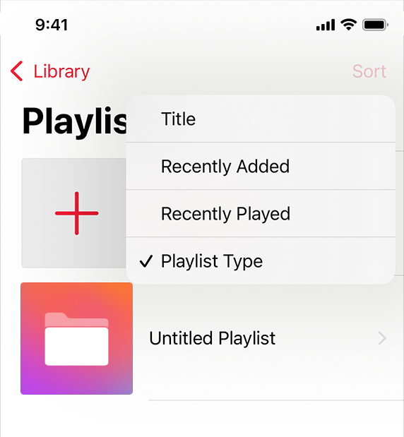
음악 앱의 라이브러리 탭에 있는 재생 목록 보기의 일부 스크린샷입니다. 화면의 오른쪽 상단 모서리에 있는 정렬 버튼을 누르면 네 가지 정렬 옵션이 나열된 메뉴가 나타납니다. Playlist Type(재생 목록 유형) 옵션 앞에는 현재 선택한 옵션임을 나타내는 확인 표시가 나타납니다.
Music uses a pop-up button to let people choose how to sort their playlists.
음악은 팝업 버튼을 사용하여 사람들이 재생 목록을 정렬하는 방법을 선택할 수 있도록 합니다.
For developer guidance, see changesSelectionAsPrimaryAction and showsMenuAsPrimaryAction.
개발자 지침은 변경 사항을 참조하십시오.SelectionAsPrimaryAction 및 showMenuAsPrimaryAction을 참조하십시오.
Use a pop-up button to present a flat list of mutually exclusive options or states. A pop-up button helps people make a choice that affects their content or the surrounding view. If you need to offer a list of actions, let people select multiple items, or provide a submenu, use a pull-down button instead.
팝업 버튼을 사용하여 상호 배타적인 옵션 또는 상태의 무계층 목록을 표시합니다. 팝업 버튼은 사용자가 자신의 내용 또는 둘러싸인 뷰에 영향을 미치는 선택을 할 수 있도록 도와줍니다. 작업 목록을 제공하거나 여러 항목을 선택하거나 하위 메뉴를 제공해야 하는 경우 풀다운 단추를 대신 사용하십시오.
Display a useful default selection. A closed pop-up button always displays the current selection, but if people haven’t made a selection yet, it displays the default item you specify. When possible, make the default selection an item that most people are likely to want.
유용한 기본 선택 항목을 표시합니다. 닫힌 팝업 단추는 항상 현재 선택을 표시하지만, 사용자가 아직 선택하지 않은 경우 사용자가 지정한 기본 항목을 표시합니다. 가능하면 기본 선택을 대부분의 사용자가 원할 수 있는 항목으로 만드십시오.
Consider using a pop-up button when space is limited and you don’t need to display all options all the time. Although a segmented control also presents a set of mutually exclusive options, it generally requires more space than a pop-up button because it always displays every item.
공간이 제한되어 있고 모든 옵션을 항상 표시할 필요가 없는 경우 팝업 버튼을 사용하는 것을 고려해 보십시오. 세그먼트 컨트롤은 상호 배타적인 옵션 집합도 제공하지만 항상 모든 항목을 표시하기 때문에 일반적으로 팝업 버튼보다 더 많은 공간이 필요합니다.
A pull-down button is a type of system button that can display a menu of items or actions that directly relate to the button’s purpose. After people choose an item in a pull-down button’s menu, the menu closes and your app performs the chosen action. People can also close the menu without choosing an item by tapping elsewhere on the screen. Unlike a pop-up button, a pull-down button always displays the same content, regardless of the menu item people choose.
풀다운 단추는 단추의 목적과 직접 관련된 항목 또는 작업의 메뉴를 표시할 수 있는 시스템 단추 유형입니다. 사람들이 풀다운 버튼의 메뉴에서 항목을 선택하면 메뉴가 닫히고 앱이 선택한 작업을 수행합니다. 사람들은 또한 화면의 다른 곳을 눌러 항목을 선택하지 않고도 메뉴를 닫을 수 있습니다. 팝업 단추와 달리, 풀다운 단추는 사용자가 선택한 메뉴 항목에 상관없이 항상 동일한 내용을 표시합니다.
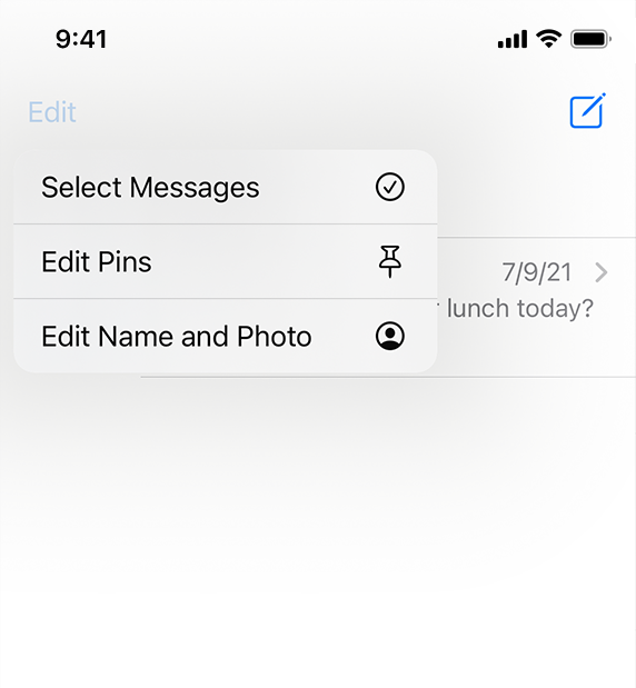
왼쪽 상단 모서리의 편집 버튼을 누르면 나타나는 메뉴를 보여주는 아이폰의 메시지 앱의 부분 스크린샷입니다. 메뉴에는 세 가지 작업이 나열됩니다. 메시지, 핀 편집 및 이름 및 사진 편집을 선택합니다.
Messages uses a pull-down button to present common editing actions.
메시지는 풀다운 단추를 사용하여 일반적인 편집 작업을 표시합니다.
NOTE
You can also let people reveal a pull-down menu by performing a specific gesture on a button. For example, in iOS 14 and later, Safari responds to a touch and hold gesture on the Tabs button by displaying a menu of tab-related actions, like New Tab and Close All Tabs.
또한 버튼에서 특정 제스처를 수행하여 풀다운 메뉴를 표시할 수 있습니다. 예를 들어 iOS 14 이상에서 Safari는 탭 단추의 터치 앤 홀드 제스처에 응답하여 새 탭 및 탭 닫기 같은 탭 관련 동작 메뉴를 표시합니다.
For developer guidance, see showsMenuAsPrimaryAction.
개발자 지침은 showsMenuAsPrimaryAction을 참조하십시오.
Use a pull-down button to present items that are directly related to the button’s action. The menu lets you help people clarify the button’s target or customize its behavior without requiring additional buttons in your interface. For example:
- An add button could present a menu that lets people specify the item they want to add.
- A sort button could use a menu to let people select an attribute on which to sort.
- A back button could let people choose a specific location to revisit instead of opening the previous one.
풀다운 단추를 사용하여 단추의 작업과 직접 관련된 항목을 표시합니다. 메뉴를 사용하면 인터페이스에 추가 버튼 없이 버튼의 대상을 명확히 하거나 동작을 사용자 정의할 수 있습니다. 예를 들어 다음과 같습니다.
- 추가 버튼은 추가할 항목을 지정할 수 있는 메뉴를 제공할 수 있습니다.
- 정렬 단추는 메뉴를 사용하여 정렬할 속성을 선택할 수 있습니다.
- 뒤로 가기 버튼은 사람들이 이전의 장소를 여는 대신 재방문할 특정 장소를 선택할 수 있게 해줍니다.
Avoid putting all of a view’s actions in one pull-down button. A view’s primary actions need to be easily discoverable, so you don’t want to hide them in a pull-down button. Putting too many actions in a pull-down button makes it less focused and means that people have to tap at least twice to do anything.
뷰의 모든 작업을 하나의 풀다운 버튼에 넣지 않도록 합니다. 뷰의 기본 작업은 쉽게 검색할 수 있어야 하므로 풀다운 단추에서 숨길 수 없습니다. 풀다운 버튼에 너무 많은 동작을 넣으면 집중력이 떨어지게 되고 사람들이 무언가를 하기 위해 적어도 두 번은 두드려야 한다는 것을 의미합니다.
Consider using a More pull-down button to present items that don’t need prominent positions in the main interface. A More button can help you offer a range of items where space is constrained, but it can also hinder discoverability. Although people generally understand that a More button offers additional functionality related to the current context, the ellipsis glyph doesn’t help them predict its contents. To design an effective More button, weigh the convenience of its size against its impact on discoverability to find a balance that works in your app. Create a More button by using the ellipsis.circle symbol (see SF Symbols to learn more about symbols).
기본 인터페이스에서 눈에 띄는 위치가 필요하지 않은 항목을 표시하려면 More(추가) 풀다운 버튼을 사용하는 것을 고려해 보십시오. 추가 단추는 공간이 제한된 다양한 항목을 제공하는 데 도움이 될 수 있지만 검색 가능성을 방해할 수도 있습니다. 사람들은 일반적으로 추가 단추가 현재 컨텍스트와 관련된 추가 기능을 제공한다는 것을 이해하지만 줄임표 글리프는 내용을 예측하는 데 도움이 되지 않습니다. 더보기 버튼을 효과적으로 설계하려면 단추 크기의 편의성과 검색 가능성에 미치는 영향을 비교하여 앱에서 적합한 균형을 찾으십시오. 줄임표.원 기호를 사용하여 추가 단추를 작성합니다(기호에 대한 자세한 내용은 SF 기호 참조).
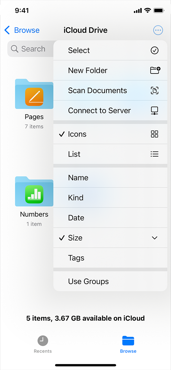
iPhone의 Files 앱 스크린샷입니다. 찾아보기 보기에서 추가 단추가 선택되었으며, 이 단추는 네 개의 그룹으로 구분된 여러 작업 및 옵션 메뉴를 표시합니다. 위쪽의 두 번째 그룹에서는 아이콘 옵션이 선택됩니다. 위쪽의 세 번째 그룹에서 크기 항목이 선택됩니다.
Files uses a More pull-down button to offer actions — like adding a folder or scanning a document — in addition to options for viewing and sorting the content.
파일에서는 추가 풀다운 단추를 사용하여 내용을 보고 정렬하는 옵션뿐만 아니라 폴더 추가 또는 문서 스캔과 같은 작업을 제공합니다.
Let people know when a pull-down button’s menu item is destructive, and ask them to confirm their intent. Menus use red text to highlight actions that you identify as potentially destructive. When people choose a destructive action, the system displays an action sheet (iOS) or popover (iPadOS) in which they can confirm their choice or cancel the action. Because an action sheet appears in a different location from the menu and requires deliberate dismissal, it can help people avoid losing data by mistake.
풀다운 버튼의 메뉴 항목이 손상되었을 때 사람들에게 알리고, 의도한 바를 확인하도록 요청합니다. 메뉴는 빨간색 텍스트를 사용하여 사용자가 파괴 가능성이 있는 것으로 식별한 작업을 강조 표시합니다. 사람들이 파괴 작업을 선택하면 시스템은 선택 사항을 확인하거나 취소할 수 있는 작업 시트(iOS) 또는 팝업오버(iPadOS)를 표시합니다. 작업 시트가 메뉴와 다른 위치에 나타나고 고의적인 해지가 필요하기 때문에 실수로 데이터를 잃어버리는 것을 방지할 수 있습니다.
Use separators to visually group related items in a pull-down button’s menu. Creating visual groupings can help people scan a menu more quickly. For example, the More button in the Files app uses separators to help people distinguish actions that affect the content from items related to viewing and sorting. Using more than three groups in a menu can make it seem difficult to parse.
풀다운 버튼 메뉴에서 관련 항목을 시각적으로 그룹화하려면 구분 기호를 사용합니다. 시각적 그룹화를 만들면 사람들이 메뉴를 더 빨리 스캔하는 데 도움이 됩니다. 예를 들어, 파일 앱의 추가 단추는 구분 기호를 사용하여 콘텐츠에 영향을 미치는 작업과 보기 및 정렬 관련 항목을 구별하는 데 도움이 됩니다. 메뉴에 세 개 이상의 그룹을 사용하면 구문 분석하기가 어려워 보일 수 있습니다.
Include a glyph with a menu item when it provides value. If you need to clarify an item’s meaning, you can display a glyph or image after its title. Using an SF symbol for this purpose can help you provide a familiar experience while ensuring that the symbol remains aligned with the text at every scale.
값을 제공할 때 메뉴 항목에 글리프를 포함합니다. 항목의 의미를 명확히 해야 할 경우, 제목 뒤에 문자 또는 이미지를 표시할 수 있습니다. 이러한 목적으로 SF 기호를 사용하면 기호를 모든 축척에서 텍스트와 정렬된 상태로 유지하면서 익숙한 경험을 제공할 수 있습니다.
Display a succinct menu title if it adds meaning. In general, a pull-down button’s content — combined with descriptive menu items — provides all the context people need, making a menu title unnecessary.
의미를 추가하는 경우 간결한 메뉴 제목을 표시합니다. 일반적으로 풀다운 단추의 내용(설명 메뉴 항목과 결합됨)은 사용자에게 필요한 모든 컨텍스트를 제공하므로 메뉴 제목이 필요하지 않습니다.
Consider using a submenu if it makes the main menu easier to understand and use. A submenu is a menu item that reveals its own menu when people choose it. After people choose an item in a submenu, the submenu closes, leaving the main menu open. Grouping closely related items into a submenu can shorten the main menu and make it easier to scan, although it requires an additional interaction to access the items. If you need to use a submenu, be sure to give it a title or glyph that clearly identifies its items so people don’t have to open it to find out what it contains.
주 메뉴를 더 쉽게 이해하고 사용할 수 있도록 하위 메뉴를 사용하는 것을 고려해 보십시오. 하위 메뉴는 사용자가 메뉴를 선택할 때 나타나는 메뉴 항목입니다. 사람들이 하위 메뉴에서 항목을 선택하면 하위 메뉴가 닫히고 기본 메뉴가 열립니다.
밀접하게 관련된 항목을 하위 메뉴로 그룹화하면 항목에 액세스하기 위해 추가적인 상호 작용이 필요하지만 기본 메뉴를 단축하고 검색하기 쉽게 만들 수 있습니다. 하위 메뉴를 사용해야 하는 경우 항목을 명확하게 식별하는 제목이나 글리프를 지정해야 합니다. 그래야 사람들이 하위 메뉴에 무엇이 포함되어 있는지 확인하기 위해 열 필요가 없습니다.
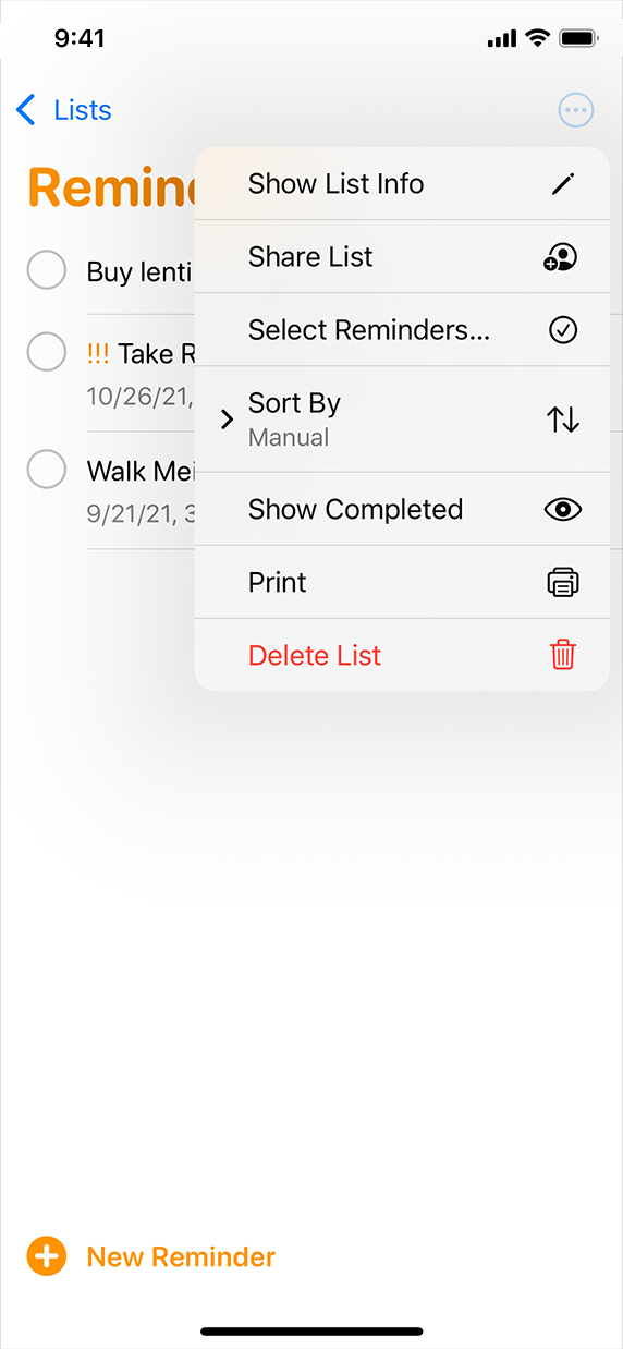
iPhone의 알림 앱의 스크린샷입니다. 추가 버튼을 선택하면 항목 메뉴가 표시됩니다. 정렬 기준 항목 앞에는 숨겨진 하위 메뉴를 나타내는 오른쪽 포인팅 쉐브론이 있습니다.
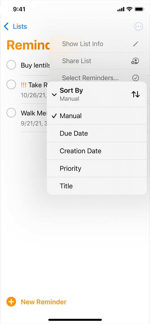
iPhone의 알림 앱의 스크린샷입니다. 추가 버튼을 선택하면 항목 메뉴가 표시됩니다. 정렬 기준 항목이 선택되어 수동 옵션이 선택된 정렬 옵션 하위 메뉴가 표시됩니다.
A close button closes its parent view. Display a close button in the top trailing corner of a sheet or a self-contained view in a collection.
닫기 버튼는 상위 보기를 닫습니다. 시트의 상단 후행 모서리 또는 집합 내 자체 포함 뷰에 닫기 버튼을 표시합니다.
지도 앱에서 위치 시트의 스크린샷이 전체 높이로 확장되었습니다. 시트의 오른쪽 상단 모서리에 닫기 버튼이 있으며, 이는 밝은 회색 디스크 내의 어두운 회색처럼 보입니다.
Choosing the close button in a sheet dismisses the sheet.
시트에서 닫기 버튼을 선택하면 시트가 해제됩니다.
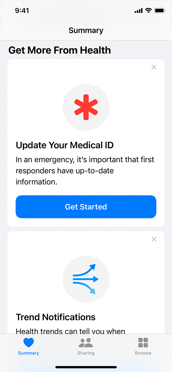
Health 앱의 Summary(요약) 탭 스크린샷에 두 개의 개별 카드 스택이 표시됩니다. 두 카드 모두 오른쪽 상단 모서리에 밝은 회색처럼 보이는 닫기 버튼이 표시됩니다.
Choosing the close button in a view that’s part of a collection removes the view from the collection.
컬렉션의 일부인 보기에서 닫기 버튼을 선택하면 집합에서 보기가 제거됩니다.
For developer guidance, see UIButton.ButtonType.close.
개발자 지침은 UIButton을 참조하십시오.ButtonType.close를 누릅니다.
Within a view, provide either a close button or a done button — don’t provide both. Close and done buttons both dismiss the view, but because they’re not opposite actions, providing both presents a confusing choice. In general, use a done button when people can make changes in the view — in this scenario, you might also want to add a cancel button to let people explicitly discard their changes when they dismiss the view. A close button doesn’t signal that it saves or discards changes, so it works well in a view that people can’t edit, or in a view that people can remove from a set of views.
뷰 내에서 닫기 버튼 또는 완료 버튼를 제공합니다. 둘 다 제공하지 않습니다. 닫기 단추와 완료 단추는 모두 보기를 무시하지만, 서로 반대되는 작업이 아니기 때문에 두 가지 모두 선택을 혼동할 수 있습니다. 일반적으로 보기를 변경할 수 있을 때 완료 단추를 사용합니다. 이 시나리오에서는 보기를 해제할 때 변경사항을 명시적으로 취소할 수 있도록 취소 단추를 추가할 수도 있습니다. 닫기 단추는 변경사항을 저장하거나 취소한다는 신호를 보내지 않으므로, 사용자가 편집할 수 없는 보기 또는 보기에서 삭제할 수 있는 보기에서 잘 작동합니다.
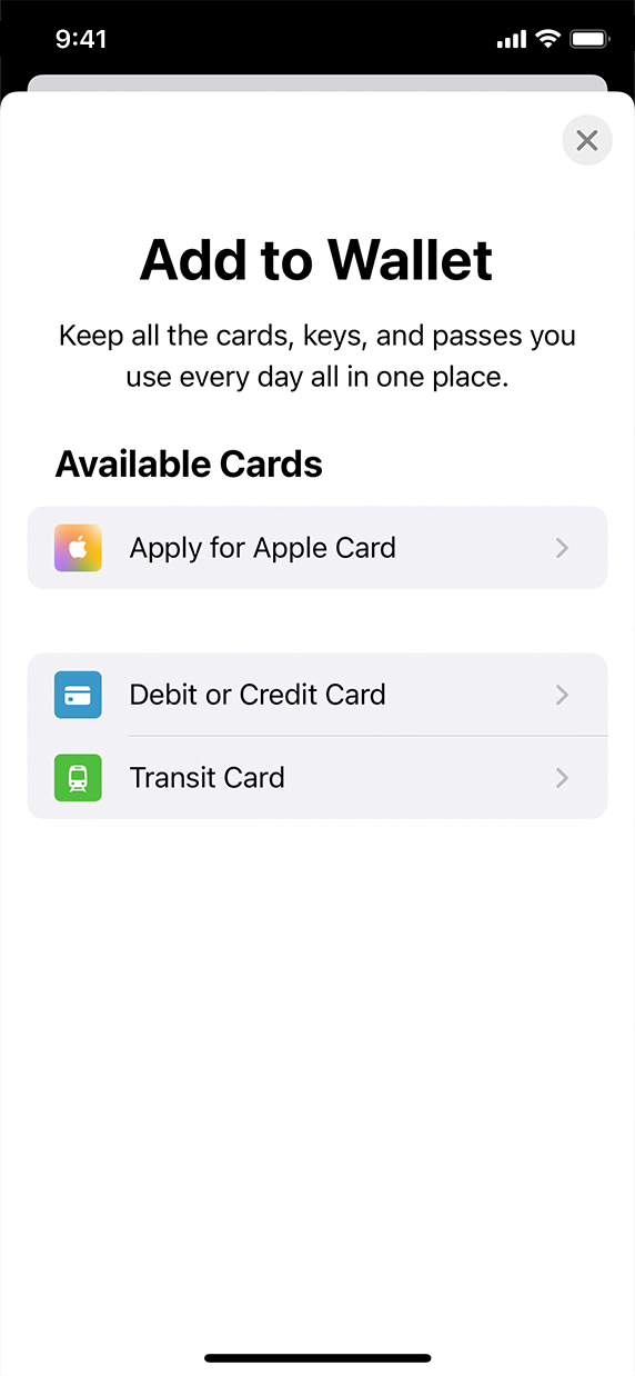
Wallet 앱의 Add to Wallet 시트의 스크린샷입니다. 이 시트에는 사용자가 월렛에 추가할 수 있는 세 가지 유형의 카드가 나열되어 있으며 오른쪽 상단 모서리에 닫기 버튼이 있습니다.
A close button dismisses the view when people finish interacting with it.
닫기 단추는 사용자가 보기와 상호 작용을 마치면 보기가 해제됩니다.
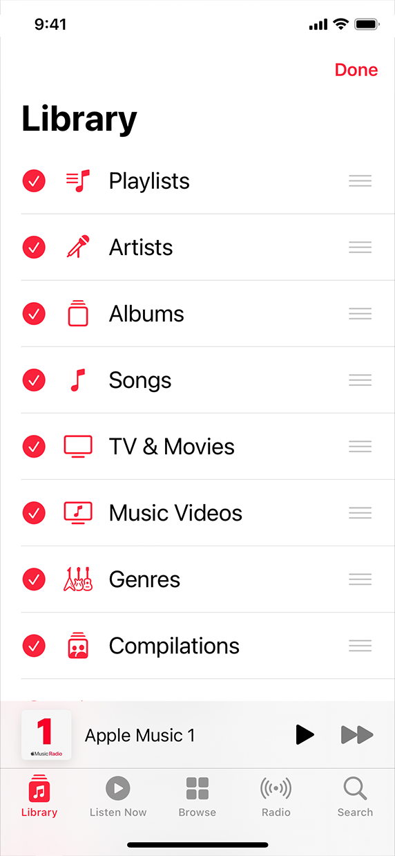
음악 앱의 라이브러리 탭 스크린샷입니다. 보기에는 재생 목록 및 아티스트와 같이 라이브러리를 정렬하는 데 사용할 수 있는 여러 범주가 나열됩니다. 보기에 오른쪽 상단 모서리에 완료라는 단추가 표시됩니다.
A done button preserves people’s changes when they dismiss the view.
완료 단추는 보기를 해제할 때 사용자의 변경사항을 보존합니다.
Provide a close button only when the view doesn’t include a pair of opposing actions that also dismiss it. For example, in a sheet that provides opposing actions like cancel and done, adding a close button is confusing because it’s not clear how it affects the view’s content.
뷰에 해당 작업을 끝내는 상반된 수행이 없는 경우에만 닫기 단추를 제공하십시오. 예를 들어, 취소 및 완료와 같은 상반되는 작업을 제공하는 시트에서 닫기 단추를 추가하면 보기 내용에 어떤 영향을 미치는지 명확하지 않으므로 혼동됩니다.
People instantly recognize several specific button types because these buttons behave consistently throughout the system. For example, an info button always reveals details related to the current context or view.
이러한 버튼은 시스템 전체에서 일관되게 작동하기 때문에 사람들은 몇 가지 특정 버튼 유형을 즉시 인식합니다. 예를 들어, 정보 단추는 항상 현재 컨텍스트 또는 보기와 관련된 세부사항을 표시합니다.
If you create a button that looks like a common button that people know, ensure that the button behaves as they expect. For example, if you create a button that uses the plus.circle SF symbol, people expect it to let them add an item to the current view. Similarly, using the info.circle symbol in a button identifies it as an info button.
사용자가 알고 있는 일반적인 단추와 같은 모양의 버튼를 만들 경우 버튼가 예상대로 작동하는지 확인합니다. 예를 들어, 더하기.circle SF 기호를 사용하는 버튼을 생성하면 현재 보기에 항목을 추가할 수 있을 것으로 예상합니다. 마찬가지로 버튼에서 info.circle 기호를 사용하면 info 버튼으로 식별됩니다.
In a list or table row, use an info button only to reveal more information about the row’s content. An info button — called a detail disclosure button when it appears in a list row — doesn’t enable navigation through a hierarchical table or list. If you need to let people drill into a list or table row’s child views, use a disclosure indicator accessory control; see disclosureIndicator(displayed:options:) (list) or disclosureIndicator (table).
목록 또는 테이블 행에서 행 내용에 대한 자세한 정보를 표시할 때만 정보 버튼를 사용합니다. 정보 단추(목록 행에 나타날 때 상세 노출 단추라고 함)는 계층적 표 또는 목록을 탐색할 수 없습니다. 목록 또는 테이블 행의 하위 보기를 드릴다운해야 하는 경우, 노출 표시기 부속품 컨트롤을 사용하십시오. 노출 참조표시기(표시됨:옵션:) 또는 공개입니다.표시기(표)를 참조하십시오.
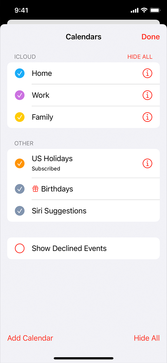
캘린더 앱에 있는 캘린더 시트의 스크린샷입니다. 시트는 사용 가능한 달력을 나열하고 달력을 추가하거나 모든 달력을 숨길 수 있는 단추를 제공합니다. 시트의 오른쪽 상단 모서리에 완료라는 버튼이 있습니다.
An info button shows details about a list item; it doesn’t enable navigation.
정보 단추는 목록 항목에 대한 세부 정보를 표시하며 탐색을 활성화하지는 않습니다.
캘린더 앱에 있는 캘린더 시트의 스크린샷입니다. 시트는 사용 가능한 달력을 나열하고 달력을 추가하거나 모든 달력을 숨길 수 있는 단추를 제공합니다. 시트의 오른쪽 상단 모서리에 완료라는 버튼이 있습니다.
A disclosure indicator reveals the next level in a hierarchy; it doesn’t show details about the item.
노출 표시기는 계층에서 다음 단계를 나타내지만 항목에 대한 세부 정보는 표시하지 않습니다.
※ 참고 출처
Buttons - Controls - iOS - Human Interface Guidelines - Apple Developer
Buttons The system offers a range of button styles that support extensive customization while providing built-in interaction states, accessibility support, and appearance adaptation. In addition, there are several system-defined button types — such as to
developer.apple.com
'HIG' 카테고리의 다른 글
| [iOS / HIG] Labels (0) | 2022.02.19 |
|---|---|
| [iOS / HIG] Context Menus (0) | 2022.02.19 |
| [iOS / HIG] Web Views (0) | 2022.02.19 |
| [iOS / HIG] Scroll Views (0) | 2022.02.19 |
| [iOS / HIG] Animation (0) | 2022.02.19 |