Navigation Bars
A navigation bar appears at the top of an app screen, below the status bar, and enables navigation through a series of hierarchical screens. When a new screen is displayed, a back button, often labeled with the title of the previous screen, appears on the left side of the bar. Sometimes, the right side of a navigation bar contains a control, like an Edit or a Done button, for managing the content within the active view. In a split view, a navigation bar may appear in a single pane of the split view. Navigation bars are translucent, may have a background tint, and can be configured to hide when the keyboard is onscreen, a gesture occurs, or a view resizes.
navigation bar는 앱 화면의 맨 위, 상태 표시줄 아래에 나타나며 일련의 계층적 화면을 탐색할 수 있습니다. 새 화면이 표시되면 보통 이전 화면 제목으로 레이블이 지정된 뒤로 버튼이 표시줄 왼쪽에 나타납니다. 때때로 네비게이션줄의 오른쪽에는 활성 보기의 내용을 관리하기 위한 편집 또는 완료 단추와 같은 컨트롤이 있습니다. split view에서 탐색 막대가 split view의 단일 창에 나타날 수 있습니다. 탐색 막대는 반투명하며 배경 색조를 가질 수 있으며 키보드가 화면에 있거나 제스처가 발생하거나 보기 크기가 조정될 때 숨기도록 구성할 수 있습니다.
Consider temporarily hiding the navigation bar to provide a more immersive experience. For example, Photos hides the navigation bar and other interface elements when people view full-screen photos. If you implement this type of behavior, let people restore the navigation bar with a simple gesture, like a tap.
보다 몰입적인 경험을 제공하기 위해 일시적으로 탐색 모음을 숨기는 것을 고려해 보십시오. 예를 들어, 사진은 사람들이 전체 화면 사진을 볼 때 탐색 모음과 기타 인터페이스 요소를 숨깁니다. 이러한 유형의 동작을 구현할 경우 탭과 같은 간단한 제스처로 navigation bar를 복원할 수 있습니다.
For developer guidance, see UINavigationBar.
개발자 지침은 UINavigationBar를 참조하십시오.
Consider showing the title of the current view in the navigation bar. In most cases, a title helps people understand what they’re looking at. However, if titling a navigation bar seems redundant, you can leave the title empty. For example, Notes doesn’t title the current note because the first line of content supplies all the context needed.
navigation bar에 현재 뷰의 제목을 표시하는 것이 좋습니다. 대부분의 경우, 제목은 사람들이 그들이 보고 있는 것을 이해하도록 돕습니다. 그러나 탐색 막대의 제목 지정이 불필요한 경우 제목을 비워둘 수 있습니다. 예를 들어, 내용의 첫 번째 줄은 필요한 모든 컨텍스트를 제공하므로 Notes는 현재 노트의 제목을 지정하지 않습니다.
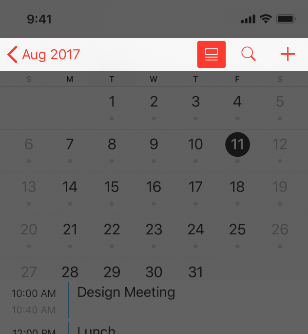
Use a large title when you want to provide extra emphasis on context. Large titles should never compete with content, but in some apps, the big, bold text of a large title can help orient people as they browse and search. In a tabbed layout, for example, large titles can help clarify the active tab and indicate when people have scrolled to the top. Phone uses this approach, while Music uses large titles to differentiate content areas like albums, artists, playlists, and radio. In iOS 13 and later, a large title navigation bar doesn’t include a background material or shadow by default. Also, a large title transitions to a standard title as people begin scrolling the content. For developer guidance, see prefersLargeTitles.
문맥을 더 강조하려면 큰 제목을 사용하십시오. 큰 제목이 콘텐츠와 경쟁해서는 안 되지만, 일부 앱에서는 큰 제목의 크고 굵은 텍스트가 사람들이 검색하고 검색할 때 방향을 지정하는 데 도움이 될 수 있습니다. 예를 들어, 탭 레이아웃에서 큰 제목을 사용하면 활성 탭을 명확히 하고 사용자가 맨 위로 스크롤한 시간을 표시할 수 있습니다. 전화기는 이 방법을 사용하는 반면 음악은 앨범, 아티스트, 재생 목록 및 라디오와 같은 콘텐츠 영역을 구분하는 데 큰 제목을 사용합니다. iOS 13 이상에서 대형 제목 탐색 모음은 기본적으로 배경 자료나 그림자를 포함하지 않습니다. 또한 큰 제목은 사용자가 내용을 스크롤하기 시작하면 표준 제목으로 전환됩니다. 개발자 지침은 LargeTitles 선호도를 참조하십시오.
Standard title
Large title
Consider hiding the border of a large-title navigation bar. In iOS 13 and later, you can hide the bottom border of a navigation bar by removing the bar’s shadow (the border automatically reappears when people scroll the content area). The borderless style works well in large-title navigation bars because it enhances the sense of connection between title and content. The borderless style may not work as well in standard-title navigation bars, though, because the bar’s title and buttons might be harder to distinguish. An exception to this is in a split view on iPad where you might want to maintain consistency between the primary and secondary views by using the borderless style in both.
큰 제목 navigation bar의 테두리를 숨기는 것이 좋습니다. iOS 13 이상에서는 표시줄의 그림자를 제거하여 navigation bar의 하단 경계를 숨길 수 있습니다(내용 영역을 스크롤하면 테두리가 자동으로 다시 표시됨). 테두리 없는 스타일은 제목과 내용 간의 연결감을 높이기 때문에 큰 제목의 탐색 막대에서 잘 작동합니다. 그러나 표준 제목 탐색 막대에서 테두리 없는 스타일은 막대의 제목과 단추를 구분하기가 더 어려울 수 있기 때문에 제대로 작동하지 않을 수 있습니다. iPad의 분할 보기에서는 예외적으로 경계 없는 스타일을 모두 사용하여 주 보기와 보조 보기 간의 일관성을 유지할 수 있습니다.
Avoid crowding a navigation bar with too many controls. In general, a navigation bar should contain no more than the view’s current title, a back button, and one control that manages the view’s contents. If you use a segmented control in the navigation bar, the bar shouldn’t include a title or any controls other than the segmented control.
컨트롤이 너무 많은 navigation bar가 밀리지 않도록 하십시오. 일반적으로 navigation bar에는 보기의 현재 제목, 뒤로 단추 및 보기의 내용을 관리하는 컨트롤이 하나만 포함되어야 합니다. 탐색 모음에서 세그먼트 컨트롤을 사용하는 경우 표시줄에 제목 또는 세그먼트 컨트롤 이외의 다른 컨트롤이 포함되어서는 안 됩니다.
If you create a custom glyph for a navigation bar control, use the following sizes, adjusting as needed for balance.
탐색 막대 컨트롤에 대한 사용자 정의 글리프를 만드는 경우 균형 조정을 위해 다음 크기를 사용합니다.
Target sizesMaximum sizes
| 24x24 pt (72x72 px @3x) | 28x28 pt (84x84 px @3x) |
| 24x24 pt (48x48 px @2x) | 28x28 pt (56x56 px @2x) |
Use the standard back button. People know that the standard back button lets them retrace their steps through a hierarchy of information. However, if you implement a custom back button, make sure it still looks like a back button, behaves as people expect, matches the rest of your interface, and is consistently implemented throughout your app. If you replace the system-provided back button chevron with a custom image, supply a custom mask image too. iOS uses this mask to animate the button title during transitions.
표준 뒤로 버튼을 사용합니다. 사람들은 표준 뒤로 버튼을 사용하여 정보 계층을 통해 자신의 단계를 다시 추적할 수 있다는 것을 알고 있습니다. 그러나 사용자 지정 뒤로 버튼을 구현하는 경우 뒤로 버튼처럼 보이고, 사람들이 기대하는 대로 동작하며, 인터페이스의 나머지 부분과 일치하며, 앱 전체에서 일관되게 구현되는지 확인하십시오. 시스템에서 제공하는 back button chevron 사용자 지정 이미지로 교체하는 경우 사용자 지정 마스크 이미지도 제공하십시오. iOS는 전환 중에 이 마스크를 사용하여 버튼 제목을 애니메이션화합니다.
Don’t include multisegment breadcrumb paths. The back button always performs a single action — returning to the previous screen. If you think people might get lost without the full path to the current screen, consider flattening your app’s hierarchy.
다중 영역 이동 경로는 포함하지 마십시오. 뒤로 버튼은 항상 이전 화면으로 돌아가는 단일 작업을 수행합니다. 현재 화면으로 가는 전체 경로가 없으면 사람들이 길을 잃을 수 있다고 생각한다면 앱의 계층을 평평하게 만드는 것을 고려해보세요.
Give text-titled buttons enough room. If your navigation bar includes multiple text buttons, the text of those buttons may appear to run together, making the buttons indistinguishable. Add separation by inserting a fixed space item between the buttons. For developer guidance, see the UIBarButtonSystemItemFixedSpace constant value in UIBarButtonItem.
텍스트 제목 버튼에 충분한 공간을 줍니다. navigation bar에 여러 개의 텍스트 버튼이 있는 경우, 버튼의 텍스트가 함께 실행되는 것처럼 보여 버튼을 구분할 수 없습니다. 버튼 사이에 고정 공백 항목을 삽입하여 분리를 추가합니다. 개발자 지침은 UIBarButtonItemFixedSpace 상수 값의 UIBarButtonItem을 참조하십시오.
Consider using a segmented control in a navigation bar to flatten your app’s information hierarchy. If you use a segmented control in a navigation bar, do so only at the top level of your hierarchy and be sure to choose accurate back-button titles at lower levels. For additional guidance, see Segmented Controls.
navigation bar에서 분할된 컨트롤을 사용하여 앱의 정보 계층을 평평하게 만드는 것을 고려해 보십시오. navigation bar에서 세그먼트화 된 컨트롤을 사용하는 경우 계층의 최상위 수준에서만 사용하고 하위 수준에서는 정확한 백버튼 제목을 선택해야 합니다. 자세한 내용은 세그먼트 컨트롤을 참조하십시오.
※ 참고 출처
Navigation Bars - Bars - iOS - Human Interface Guidelines - Apple Developer
Navigation Bars A navigation bar appears at the top of an app screen, below the status bar, and enables navigation through a series of hierarchical screens. When a new screen is displayed, a back button, often labeled with the title of the previous screen,
developer.apple.com
'HIG' 카테고리의 다른 글
| [iOS / HIG] Status Bars (0) | 2022.02.05 |
|---|---|
| [iOS / HIG] Search Bars (0) | 2022.02.05 |
| [iOS / HIG] App Icon (0) | 2022.02.05 |
| [iOS / HIG] Image Size and Resolution (0) | 2022.02.05 |
| [iOS / HIG] Adaptivity and Layout (0) | 2022.02.05 |