App Icon
Every app needs a beautiful and memorable icon that attracts attention in the App Store and stands out on the Home screen. Your icon is the first opportunity to communicate, at a glance, your app’s purpose. It also appears throughout the system, such as in Settings and search results.
모든 앱은 앱스토어에서 시선을 끌고 홈 스크린에서 눈에 띄는 아름답고 기억에 남는 아이콘이 필요합니다. 당신의 아이콘은 당신의 앱의 목적을 한눈에 알 수 있는 첫 번째 기회입니다. 또한 설정 및 검색 결과와 같은 시스템 전체에서 나타납니다.


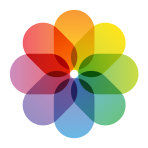
Embrace simplicity. Find a single element that captures the essence of your app and express that element in a simple, unique shape. Add details cautiously. If an icon’s content or shape is overly complex, the details can be hard to discern, especially at smaller sizes.
단순성을 수용합니다. 앱의 본질을 포착하는 단일 요소를 찾아 단순하고 독특한 모양으로 표현하세요. 세부 사항을 주의하여 추가하십시오. 아이콘의 내용이나 모양이 지나치게 복잡한 경우 특히 크기가 작을 경우 세부 정보를 식별하기 어려울 수 있습니다.
Provide a single focus point. Design an icon with a single, centered point that immediately captures attention and clearly identifies your app.
단일 포커스를 제공합니다. 즉시 시선을 사로잡고 앱을 명확하게 식별할 수 있는 하나의 중심점으로 아이콘을 디자인합니다.
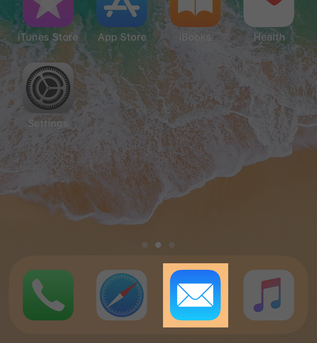
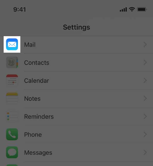
Design a recognizable icon. People shouldn’t have to analyze the icon to figure out what it represents. For example, the Mail app icon uses an envelope, which is universally associated with mail. Take time to design a beautiful and engaging abstract icon that artistically represents your app’s purpose.
인식 가능한 아이콘을 디자인합니다. 사람들은 그것이 무엇을 나타내는지 알아내기 위해 그 아이콘을 분석할 필요가 없습니다. 예를 들어 메일 앱 아이콘은 일반적으로 메일과 연결된 봉투를 사용합니다. 당신의 앱의 목적을 예술적으로 나타내는 아름답고 매력적인 추상 아이콘을 디자인하는 시간을 가지세요.
Keep the background simple and avoid transparency. Make sure your icon is opaque, and don’t clutter the background. Give it a simple background so it doesn’t overpower other app icons nearby. You don’t need to fill the entire icon with content.
배경을 단순하게 유지하고 투명성을 피하세요. 아이콘이 불투명한지 확인하고 배경을 흐트러뜨리지 마십시오. 주변의 다른 앱 아이콘들을 압도하지 않도록 간단한 배경을 제공하세요. 아이콘 전체를 콘텐츠로 채울 필요는 없습니다.
Use words only when they’re essential or part of a logo. An app’s name appears below its icon on the Home screen. Don’t include nonessential words that repeat the name or tell people what to do with your app, like "Watch" or "Play." If your design includes any text, emphasize words that relate to the actual content your app offers.
단어가 필수적이거나 로고의 일부일 때만 사용하십시오. 홈 스크린의 아이콘 아래에 앱 이름이 나타납니다. 이름을 반복하거나 "시청" 또는 "재생"과 같이 앱으로 수행할 작업을 알려주는 불필요한 단어를 포함하지 마십시오. 디자인에 텍스트가 포함된 경우 앱에서 제공하는 실제 콘텐츠와 관련된 단어를 강조합니다.
Don’t include photos, screenshots, or interface elements. Photographic details can be very hard to see at small sizes. Screenshots are too complex for an app icon and don’t generally help communicate your app’s purpose. Interface elements in an icon are misleading and confusing.
사진, 스크린샷 또는 인터페이스 요소를 포함하지 마십시오. 작은 크기에서는 사진 세부 사항을 보기가 매우 어려울 수 있습니다. 스크린샷은 앱 아이콘에 비해 너무 복잡하며 일반적으로 앱의 목적을 전달하는 데 도움이 되지 않습니다. 아이콘의 인터페이스 요소는 오해의 소지가 있고 혼란스럽습니다.
Don’t use replicas of Apple hardware products. Apple products are copyrighted and can’t be reproduced in your icons or images. In general, avoid displaying replicas of devices, because hardware designs tend to change frequently and can make your icon look dated.
Apple 하드웨어 제품의 복제품을 사용하지 마십시오. Apple 제품은 저작권이 있으며 아이콘이나 이미지에서 복제할 수 없습니다. 하드웨어 설계는 자주 변경되며 아이콘을 오래된 것처럼 보이게 할 수 있으므로 일반적으로 장치 복제본을 표시하지 마십시오.
Don’t place your app icon throughout the interface. It can be confusing to see an icon used for different purposes throughout an app. Instead, consider incorporating your icon’s color scheme. See Color.
인터페이스 전체에 앱 아이콘을 배치하지 마십시오. 앱에서 다른 용도로 사용되는 아이콘을 보면 혼란스러울 수 있습니다. 대신, 아이콘의 색상표를 통합하는 것을 고려해보세요. 색상을 참조하십시오.
Test your icon against different wallpapers. You can’t predict which wallpaper people will choose for their Home screen, so don’t just test your app against a light or dark color. See how it looks over different photos. Try it on an actual device with a dynamic background that changes perspective as the device moves.
아이콘을 다른 배경화면에 대해 테스트합니다. 홈 스크린에 대해 사용자가 어떤 배경화면을 선택할지 예측할 수 없으므로 밝은 색이나 어두운 색에 대해서만 프로그램을 테스트하지 마십시오. 다른 사진들 위에서 어떻게 보이는지 보세요. 장치가 이동함에 따라 원근법이 바뀌는 동적 배경을 가진 실제 장치에서 사용해 보십시오.
Keep icon corners square. The system applies a mask that rounds icon corners automatically.
아이콘 모서리를 정사각형으로 유지합니다. 시스템이 아이콘 모서리를 자동으로 반올림하는 마스크를 적용합니다.
App Icon Attributes
앱 아이콘 속성
All app icons should adhere to the following specifications.
모든 앱 아이콘은 다음 사양을 준수해야 합니다.
Attribute Value
| Format | PNG |
| Color space | Display P3 (wide-gamut color), sRGB (color), or Gray Gamma 2.2 (grayscale). See Color Management. |
| Layers | Flattened with no transparency |
| Resolution | Varies. See Image Size and Resolution. |
| Shape | Square with no rounded corners |
App Icon Sizes
Every app must supply small icons for display on the Home screen and throughout the system when your app is installed, as well as a larger icon for display in the App Store.
모든 앱은 앱이 설치될 때 홈 스크린과 시스템 전체에 표시할 수 있는 작은 아이콘과 앱 스토어에 표시할 큰 아이콘을 제공해야 합니다.
Device or contextIcon size
| iPhone | 60x60 pt (180x180 px @3x) |
| 60x60 pt (120x120 px @2x) | |
| iPad Pro | 83.5x83.5 pt (167x167 px @2x) |
| iPad, iPad mini | 76x76 pt (152x152 px @2x) |
| App Store | 1024x1024 pt (1024x1024 px @1x) |
Provide different sized icons for different devices. Make sure that your app icon looks great on all the devices you support.
장치마다 다른 크기의 아이콘을 제공합니다. 지원하는 모든 장치에서 앱 아이콘이 잘 나타나는지 확인하십시오.
Mimic your small icon with your App Store icon. Although the App Store icon is used differently than the small one, it’s still your app icon. It should generally match the smaller version in appearance, although it can be subtly richer and more detailed because there are no visual effects applied to it.
앱 스토어 아이콘으로 작은 아이콘을 흉내내세요. 앱스토어 아이콘은 작은 앱과 다르게 사용되지만, 여전히 당신의 앱 아이콘입니다. 일반적으로 작은 버전의 모양과 일치해야 하지만 시각적 효과가 적용되지 않기 때문에 미묘하게 풍부하고 상세할 수 있습니다.
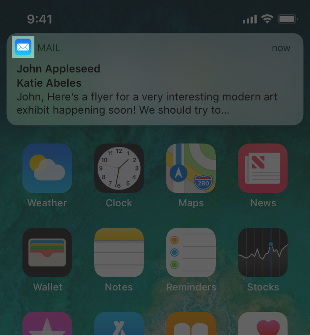
Spotlight, Settings, and Notification Icons
스포트라이트, 설정 및 알림 아이콘입니다.
Every app should also provide a small icon that iOS can display when the app name matches a term in a Spotlight search. Additionally, apps with settings should provide a small icon to display in the built-in Settings app, and apps that support notifications should provide a small icon to display in notifications. All icons should clearly identify your app — ideally, they should match your app icon. If you don’t provide these icons, iOS might shrink your primary app icon for display in these locations.
모든 앱은 앱 이름이 스포트라이트 검색의 용어와 일치할 때 iOS가 표시할 수 있는 작은 아이콘도 제공해야 합니다. 또한 설정이 있는 앱은 기본 제공 설정 앱에 표시할 작은 아이콘을 제공하고 알림을 지원하는 앱은 알림에 표시할 작은 아이콘을 제공해야 합니다. 모든 아이콘은 사용자의 앱을 명확하게 식별해야 하며, 앱 아이콘과 일치하는 것이 이상적입니다. 이러한 아이콘을 제공하지 않으면 iOS가 이러한 위치에 표시하기 위해 기본 앱 아이콘을 축소할 수 있습니다.
DeviceSpotlight icon size
| iPhone | 40x40 pt (120x120 px @3x) |
| 40x40 pt (80x80 px @2x) | |
| iPad Pro, iPad, iPad mini | 40x40 pt (80x80 px @2x) |
DeviceSettings icon size
| iPhone | 29x29 pt (87x87 px @3x) |
| 29x29 pt (58x58 px @2x) | |
| iPad Pro, iPad, iPad mini | 29x29 pt (58x58 px @2x) |
DeviceNotification icon size
| iPhone | 38x38 pt (114x114 px @3x) |
| 38x38 pt (76x76 px @2x) | |
| iPad Pro, iPad, iPad mini | 38x38 pt (76x76 px @2x) |
Don’t add an overlay or border to your Settings icon. iOS automatically adds a 1-pixel stroke to all icons so that they look good on the white background of Settings.
설정 아이콘에 오버레이나 테두리를 추가하지 마십시오. iOS는 설정의 흰색 배경에 잘 보이도록 모든 아이콘에 1픽셀 스트로크를 자동으로 추가합니다.
TIP
If your app creates custom documents, you don’t need to design document icons because iOS uses your app icon to create document icons automatically.
앱이 사용자 정의 문서를 작성하는 경우, iOS는 앱 아이콘을 사용하여 문서 아이콘을 자동으로 만들기 때문에 문서 아이콘을 설계할 필요가 없습니다.
User-Selectable App Icons
사용자가 선택할 수 있는 앱 아이콘
For some apps, customization is a feature that evokes a personal connection and enhances the user experience. If it provides value in your app, you can let people select an alternate app icon from a set of predefined icons that are embedded within your app. For example, a sports app might offer icons for different teams or an app with light and dark modes might offer corresponding light and dark icons. Only users can choose one of the alternate app icons you supply, and the system always provides confirmation when people make this change.
일부 앱에서 커스터마이징은 개인 연결을 호출하고 사용자 경험을 향상시키는 기능입니다. 앱에 가치가 있는 경우 앱에 내장된 미리 정의된 아이콘 집합에서 대체 앱 아이콘을 선택하도록 할 수 있습니다. 예를 들어, 스포츠 앱은 여러 팀의 아이콘을 제공할 수도 있고, 밝은 모드와 어두운 모드가 있는 앱은 그에 상응하는 밝은 아이콘과 어두운 아이콘을 제공할 수도 있습니다. 사용자만 사용자가 제공하는 대체 앱 아이콘 중 하나를 선택할 수 있으며, 시스템은 사용자가 이를 변경할 때 항상 확인을 제공합니다.
Provide visually consistent alternate icons in all necessary sizes. Like your primary app icon, you deliver each alternate app icon as a collection of related images that vary in size. When people choose an alternate icon, the system replaces your primary app icon with the appropriately sized alternate icon on the Home screen, in Spotlight, and elsewhere in the system. To ensure that alternate icons appear consistently throughout the system, provide them in the same sizes you use for your primary app icon.
필요한 모든 크기로 시각적으로 일관된 대체 아이콘을 제공합니다. 기본 앱 아이콘과 마찬가지로 각 대체 앱 아이콘을 크기가 다양한 관련 이미지 모음으로 제공합니다. 다른 사용자가 대체 아이콘을 선택하면 시스템은 홈 스크린, 스포트라이트 및 시스템의 다른 위치에서 기본 앱 아이콘을 적절한 크기의 대체 아이콘으로 바꿉니다. 대체 아이콘이 시스템 전체에서 일관되게 나타나도록 하려면 기본 앱 아이콘과 동일한 크기로 제공하십시오.
For developer guidance, see the setAlternateIconName method of UIApplication.
개발자 지침은 UIApplication의 setAlternateIconName 방법을 참조하십시오.
NOTE
Alternate app icons are subject to app review and must adhere to the App Store Review Guidelines.
대체 앱 아이콘은 앱 검토의 대상이 되며 앱 스토어 검토 지침을 준수해야 합니다.
※ 참고 출처
App Icon - Icons and Images - iOS - Human Interface Guidelines - Apple Developer
App Icon Every app needs a beautiful and memorable icon that attracts attention in the App Store and stands out on the Home screen. Your icon is the first opportunity to communicate, at a glance, your app’s purpose. It also appears throughout the system,
developer.apple.com
'HIG' 카테고리의 다른 글
| [iOS / HIG] Search Bars (0) | 2022.02.05 |
|---|---|
| [iOS / HIG] Navigation Bars (0) | 2022.02.05 |
| [iOS / HIG] Image Size and Resolution (0) | 2022.02.05 |
| [iOS / HIG] Adaptivity and Layout (0) | 2022.02.05 |
| [iOS / HIG] Navigation (0) | 2022.02.04 |