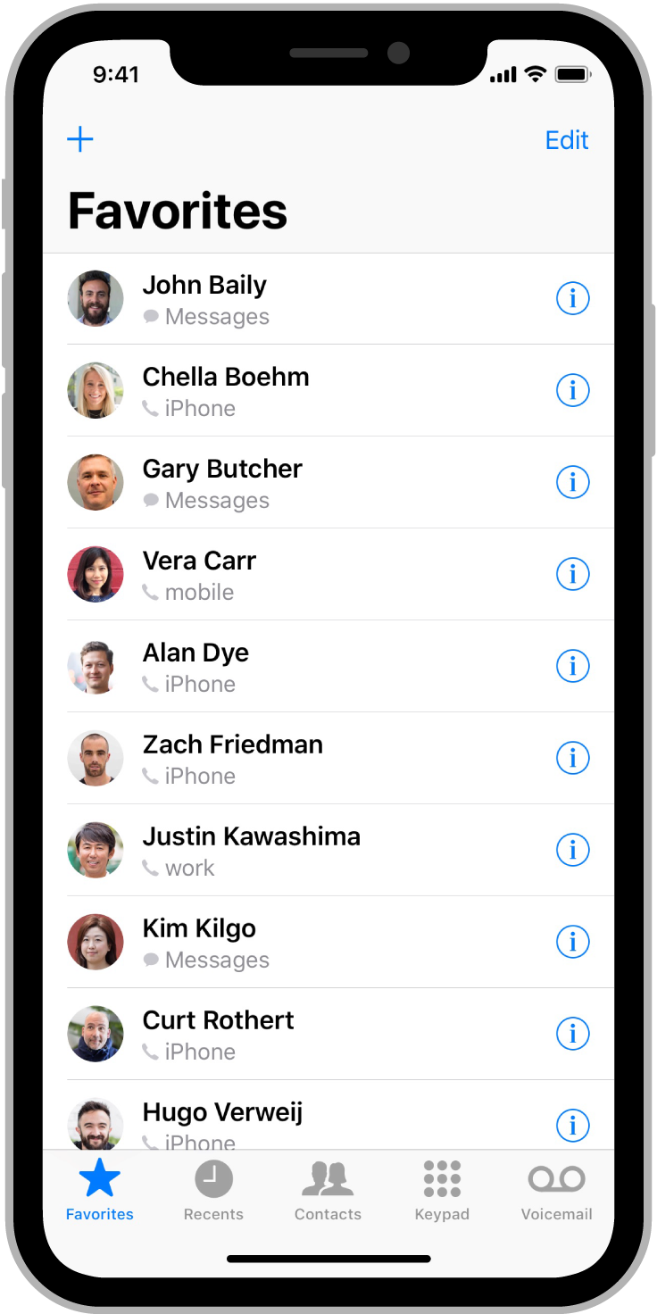
Adaptivity and Layout
적응성 및 레이아웃
People generally want to be able to use their favorite apps on all of their devices and in any context. To meet this expectation, design an adaptable interface by configuring UI elements and layouts to automatically change shape and size on different devices, during multitasking on iPad, in split view, when the screen rotates, and more.
사람들은 일반적으로 자신이 좋아하는 앱을 모든 기기에서 그리고 어떤 맥락에서든 사용할 수 있기를 원합니다. 이러한 기대에 부응하기 위해 iPad에서 멀티태스킹하는 동안, 분할 보기에서, 화면이 회전할 때 등에 UI 요소와 레이아웃이 자동으로 모양과 크기를 변경하도록 구성하여 적응 가능한 인터페이스를 설계하십시오.
Device Screen Sizes and Orientations
장치 화면 크기 및 방향입니다.
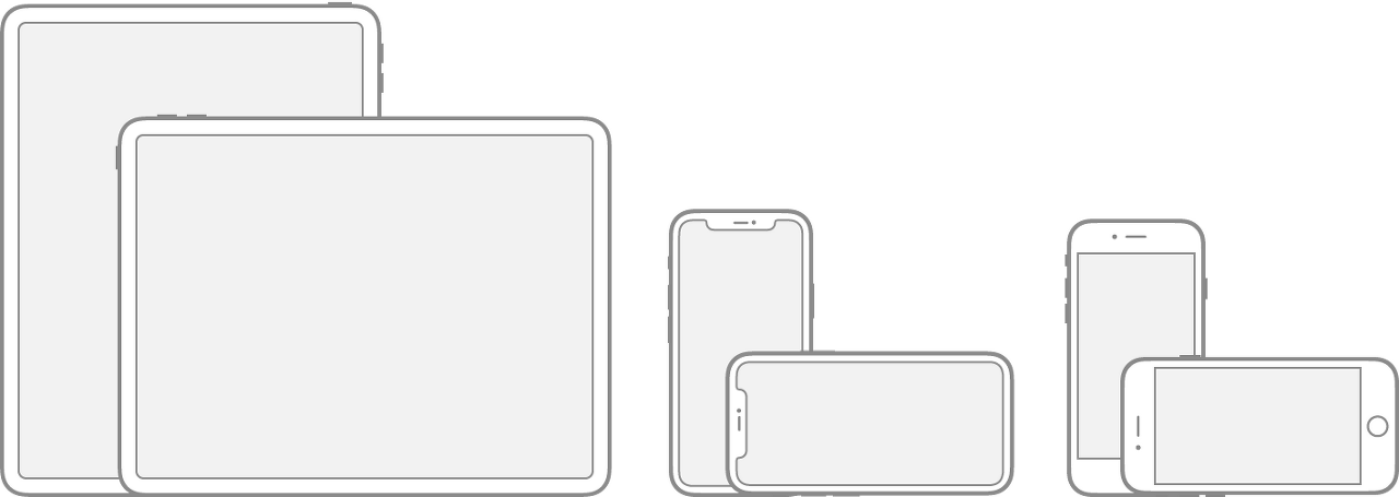
iOS devices have a variety of screen sizes and people can use them in either portrait or landscape orientation. In edge-to-edge devices like iPhone X and iPad Pro, the display has rounded corners that closely match the device’s overall dimensions. Other devices — such as iPhone SE and iPad Air — have a rectangular display.
iOS 기기들은 화면 크기가 다양하며 사람들은 세로 방향이나 가로 방향으로 사용할 수 있습니다. iPhone X와 iPad Pro와 같은 에지 투 에지 장치에서는 디스플레이가 장치의 전체 치수와 거의 일치하는 둥근 모서리를 가지고 있습니다. iPhone SE 및 iPad Air와 같은 다른 장치에는 직사각형 디스플레이가 있습니다.
If your app runs on a specific device, make sure it runs on every screen size for that device. In other words, an iPhone-only app must run on every iPhone screen size and an iPad-only app must run on every iPad screen size.
앱이 특정 장치에서 실행되는 경우 해당 장치의 모든 화면 크기에서 실행되도록 합니다. 즉, iPhone 전용 앱은 모든 iPhone 화면 크기에서 실행되어야 하며 iPad 전용 앱은 모든 iPad 화면 크기에서 실행되어야 합니다.
DeviceDimensions (portrait)
DeviceDimensions(세로)를 클릭합니다.
| 12.9" iPad Pro | 1024x1366 pt (2048x2732 px @2x) |
| 11" iPad Pro | 834x1194 pt (1668x2388 px @2x) |
| 10.5" iPad Pro | 834x1194 pt (1668x2388 px @2x) |
| 9.7" iPad Pro | 768x1024 pt (1536x2048 px @2x) |
| 7.9" iPad mini | 768x1024 pt (1536x2048 px @2x) |
| 10.5" iPad Air | 834x1112 pt (1668x2224 px @2x) |
| 9.7" iPad Air | 768x1024 pt (1536x2048 px @2x) |
| 10.2" iPad | 810x1080 pt (1620x2160 px @2x) |
| 9.7" iPad | 768x1024 pt (1536x2048 px @2x) |
| iPhone 13 Pro Max | 428x926 pt (1284x2778 px @3x) |
| iPhone 13 Pro | 390x844 pt (1170x2532 px @3x) |
| iPhone 13 | 390x844 pt (1170x2532 px @3x) |
| iPhone 13 mini | 375x812 pt (1125x2436 px @3x) |
| iPhone 12 Pro Max | 428x926 pt (1284x2778 px @3x) |
| iPhone 12 Pro | 390x844 pt (1170x2532 px @3x) |
| iPhone 12 | 390x844 pt (1170x2532 px @3x) |
| iPhone 12 mini | 375x812 pt (1125x2436 px @3x) |
| iPhone 11 Pro Max | 414x896 pt (1242x2688 px @3x) |
| iPhone 11 Pro | 375x812 pt (1125x2436 px @3x) |
| iPhone 11 | 414x896 pt (828x1792 px @2x) |
| iPhone XS Max | 414x896 pt (1242x2688 px @3x) |
| iPhone XS | 375x812 pt (1125x2436 px @3x) |
| iPhone XR | 414x896 pt (828x1792 px @2x) |
| iPhone X | 375x812 pt (1125x2436 px @3x) |
| iPhone 8 Plus | 414x736 pt (1080x1920 px @3x) |
| iPhone 8 | 375x667 pt (750x1334 px @2x) |
| iPhone 7 Plus | 414x736 pt (1080x1920 px @3x) |
| iPhone 7 | 375x667 pt (750x1334 px @2x) |
| iPhone 6s Plus | 414x736 pt (1080x1920 px @3x) |
| iPhone 6s | 375x667 pt (750x1334 px @2x) |
| iPhone 6 Plus | 414x736 pt (1080x1920 px @3x) |
| iPhone 6 | 375x667 pt (750x1334 px @2x) |
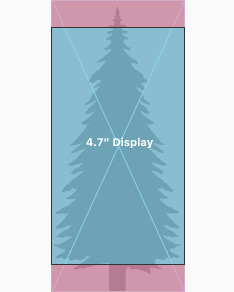
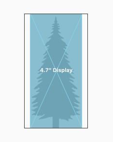
| 4.7" iPhone SE | 375x667 pt (750x1334 px @2x) |
| 4" iPhone SE | 320x568 pt (640x1136 px @2x) |
| iPod touch 5th generation and later | 320x568 pt (640x1136 px @2x) |
NOTE
All scale factors in the table above are UIKit scale factors, which may differ from native scale factors. For developer guidance, see scale and nativeScale.
위 표의 모든 척도 요인은 기본 척도 요인과 다를 수 있는 UIKit 척도 요인입니다. 개발자 지침은 척도 및 nativeScale을 참조하십시오.
To learn how screen resolution impacts your app’s artwork, see Image Size and Resolution.
화면 해상도가 앱의 아트워크에 어떤 영향을 미치는지 알아보려면 이미지 크기 및 해상도를 참조하십시오.
Auto Layout
오토 레이아웃
Auto Layout is a development tool for constructing adaptive interfaces. Using Auto Layout, you can define rules (known as constraints) that govern the content in your app. For example, you can constrain a button so it’s always horizontally centered and positioned eight points below an image, regardless of the available screen space.
오토 레이아웃은 적응형 인터페이스를 구성하기 위한 개발 도구입니다. 자동 레이아웃을 사용하면 앱의 콘텐츠를 제어하는 규칙(제한조건이라고 함)을 정의할 수 있습니다. 예를 들어, 버튼을 제한하여 사용 가능한 화면 공간에 관계없이 항상 이미지 아래 8포인트 가로 가운데에 위치하도록 할 수 있습니다.
Auto Layout automatically readjusts layouts according to the constraints you specify for certain environmental variations, known as traits. You can set your app to dynamically adapt to a wide range of traits, including:
자동 레이아웃은 특성으로 알려진 특정 환경 변형에 대해 지정한 제약 조건에 따라 레이아웃을 자동으로 재조정합니다. 다음과 같은 다양한 특성에 맞게 앱을 설정할 수 있습니다.
- Different device screen sizes, resolutions, and color gamuts (sRGB/P3)
- Different device orientations (portrait/landscape)
- Split view
- Multitasking modes on iPad
- Dynamic Type text-size changes
- Internationalization features that are enabled based on locale (left-to-right/right-to-left layout direction, date/time/number formatting, font variation, text length)
- System feature availability (3D Touch)
장치 화면 크기, 해상도 및 색 영역(sRGB/P3)이 다릅니다.
장치 방향이 다릅니다(세로/가로).
Split view
iPad에서 멀티태스킹 모드입니다.
동적 유형 텍스트 크기가 변경됩니다.
locale(왼쪽에서 오른쪽으로/오른쪽에서 왼쪽으로 레이아웃 방향, 날짜/시간/숫자 형식, 글꼴 변형, 텍스트 길이)을 기준으로 활성화되는 국제화 기능입니다.
시스템 기능을 사용할 수 있습니다(3D Touch).
For developer guidance, see NSLayoutConstraint and UITraitCollection.
개발자 지침은 NSLayoutConstraint 및 UITraitCollection을 참조하십시오.
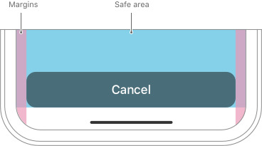
Layout Guides and Safe Areas
레이아웃 가이드 및 안전 영역입니다.
A layout guide defines a rectangular region that helps you position, align, and space your content on the screen. The system includes predefined layout guides that make it easy to apply standard margins around content and restrict the width of text for optimal readability. You can also define custom layout guides.
레이아웃 가이드는 화면에서 콘텐츠를 배치, 정렬 및 띄우는 데 도움이 되는 직사각형 영역을 정의합니다. 이 시스템에는 콘텐츠 주위에 표준 여백을 쉽게 적용하고 최적의 가독성을 위해 텍스트 너비를 제한할 수 있는 미리 정의된 레이아웃 가이드가 포함되어 있습니다. 사용자 정의 레이아웃 가이드를 정의할 수도 있습니다.
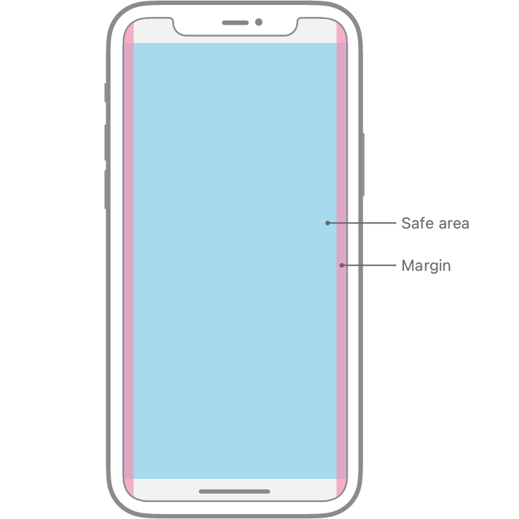
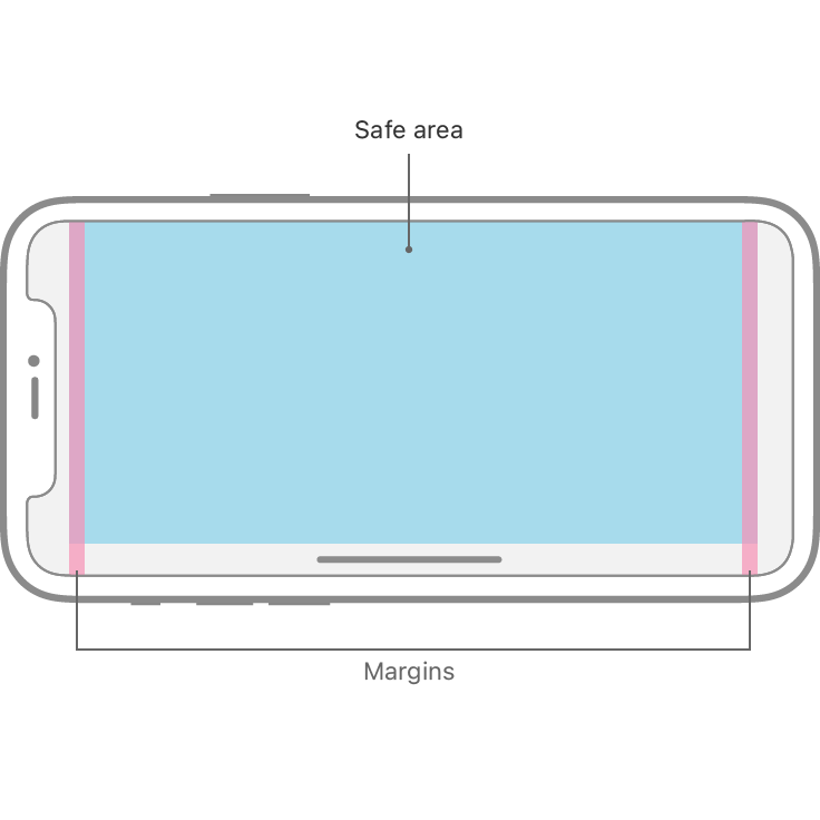
A safe area defines the area within a view that isn’t covered by a navigation bar, tab bar, toolbar, or other views a view controller might provide.
안전 영역은 보기 컨트롤러가 제공할 수 있는 navigation bar, tab bar, tool bar 또는 기타 view에서 다루지 않는 view 내의 영역을 정의합니다.
iOS 15 and later defines a keyboard layout guide that represents the space the keyboard currently occupies and accounts for safe area insets. Using this guide can help you make the keyboard feel like an integral part of your app, regardless of the type of keyboard people use or where they position it. For developer guidance, see UIKeyboardLayoutGuide.
iOS 15 이상에서는 키보드가 현재 차지하는 공간과 안전 영역 삽입물을 설명하는 키보드 레이아웃 가이드를 정의합니다. 이 안내서를 사용하면 사용자가 사용하는 키보드 종류나 위치를 불문하고 키보드가 앱의 필수 요소처럼 느껴지도록 할 수 있습니다. 개발자 지침은 UIKeyboardLayoutGuide를 참조하십시오.
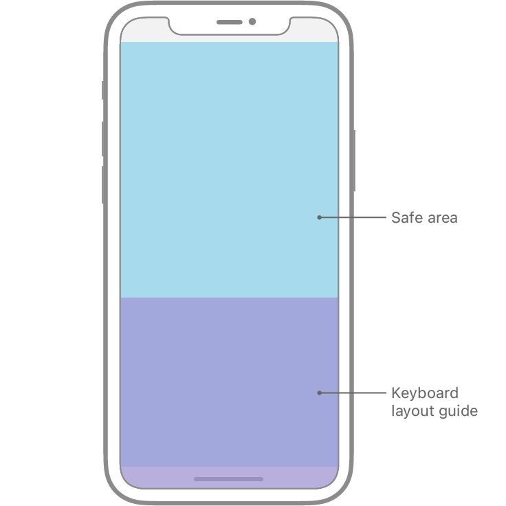
When the keyboard is visible, the layout guide represents its area and position.
키보드가 보이면 레이아웃 가이드가 해당 영역과 위치를 나타냅니다.
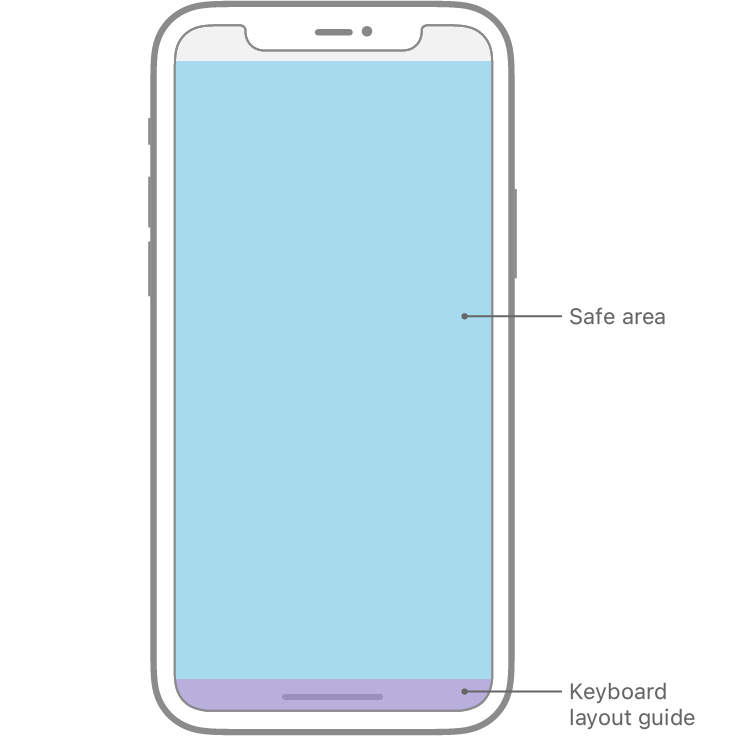
When the keyboard dismisses, the top of the layout guide matches the bottom of the safe area layout guide.
키보드가 해제되면 레이아웃 가이드의 상단이 안전 영역 레이아웃 가이드 하단과 일치합니다.
Adhere to the system-defined safe areas and layout margins. These layout guides ensure appropriate insetting based on the device and context. The safe area also prevents content from underlapping the status bar, navigation bar, toolbar, and tab bar. Standard system-provided views automatically adopt a safe area layout guide.
시스템 정의 안전 영역 및 배치 margin을 준수합니다. 이러한 레이아웃 가이드는 장치와 상황에 따라 적절한 내부 세팅을 보장합니다. 또한 안전 영역에 있는 콘텐츠가 status bar, navigation bar, toolbar, and tab bar에 언더 랩 되지 않도록 합니다. 표준 시스템 제공 보기는 자동으로 안전 영역 레이아웃 가이드를 채택합니다.
For developer guidance, see Positioning Content Relative to the Safe Area and Positioning Content Within Layout Margins.
개발자 지침은 안전 영역에 상대적인 콘텐츠 배치 및 레이아웃 여백 내에 콘텐츠 배치를 참조하십시오.
Size Classes
클래스 크기를 지정합니다.
Size classes are traits that are automatically assigned to content areas based on their size. The system defines two size classes, regular (denotes expansive space) and compact (denotes constrained space), which describe the height and width of a view.
크기 클래스는 크기에 따라 내용 영역에 자동으로 할당되는 특성입니다. 시스템은 뷰의 높이와 너비를 설명하는 두 가지 크기 클래스: regular(일반 공간 표시)와 compact(제한된 공간 표시)를 정의합니다.
A view may possess any combination of size classes:
보기는 다음과 같은 크기 클래스의 조합을 가질 수 있습니다.
- Regular width, regular height
- Compact width, compact height
- Regular width, compact height
- Compact width, regular height
As with other environmental variations, iOS dynamically makes layout adjustments based on the size classes of a content area. For example, when the vertical size class changes from compact height to regular height — such as when the device rotates from landscape to portrait orientation — tab bars may become taller.
다른 환경 변형과 마찬가지로 iOS는 콘텐츠 영역의 크기 클래스에 따라 동적으로 레이아웃을 조정합니다. 예를 들어, 단말기가 가로에서 세로 방향으로 회전하는 경우와 같이 수직 크기 클래스가 콤팩트 높이에서 일반 높이로 변경되면 탭 막대가 더 커질 수 있습니다.
Device Size Classes
장치 크기 클래스입니다.
Different size class combinations apply to the full-screen experience on different devices, based on screen size.
화면 크기에 따라 여러 장치의 전체 화면 환경에는 다양한 크기 클래스 조합이 적용됩니다.

DevicePortrait orientationLandscape orientation
DevicePortrait 방향가로 방향입니다.
| 12.9" iPad Pro | Regular width, regular height | Regular width, regular height |
| 11" iPad Pro | Regular width, regular height | Regular width, regular height |
| 10.5" iPad Pro | Regular width, regular height | Regular width, regular height |
| 9.7" iPad | Regular width, regular height | Regular width, regular height |
| 7.9" iPad mini | Regular width, regular height | Regular width, regular height |
| iPhone 12 Pro Max | Compact width, regular height | Regular width, compact height |
| iPhone 12 Pro | Compact width, regular height | Compact width, compact height |
| iPhone 12 | Compact width, regular height | Compact width, compact height |
| iPhone 12 mini | Compact width, regular height | Compact width, compact height |
| iPhone 11 Pro Max | Compact width, regular height | Regular width, compact height |
| iPhone 11 Pro | Compact width, regular height | Compact width, compact height |
| iPhone 11 | Compact width, regular height | Regular width, compact height |
| iPhone XS Max | Compact width, regular height | Regular width, compact height |
| iPhone XS | Compact width, regular height | Compact width, compact height |
| iPhone XR | Compact width, regular height | Regular width, compact height |
| iPhone X | Compact width, regular height | Compact width, compact height |
| iPhone 8 Plus | Compact width, regular height | Regular width, compact height |
| iPhone 8 | Compact width, regular height | Compact width, compact height |
| iPhone 7 Plus | Compact width, regular height | Regular width, compact height |
| iPhone 7 | Compact width, regular height | Compact width, compact height |
| iPhone 6s Plus | Compact width, regular height | Regular width, compact height |
| iPhone 6s | Compact width, regular height | Compact width, compact height |
| iPhone SE | Compact width, regular height | Compact width, compact height |
| iPod touch 5th generation and later | Compact width, regular height | Compact width, compact height |
Multitasking Size Classes
다중 작업 크기 클래스입니다.
On iPad, size classes also apply when your app runs in a multitasking configuration.
iPad에서 크기 클래스는 앱이 멀티태스킹 구성으로 실행될 때도 적용됩니다.
2/3 split view
1/2 split view
1/3 split view
DeviceModePortrait orientationLandscape orientation
| 12.9" iPad Pro | 2/3 split view | Compact width, regular height | Regular width, regular height |
| 1/2 split view | N/A | Regular width, regular height | |
| 1/3 split view | Compact width, regular height | Compact width, regular height | |
| 11" iPad Pro | 2/3 split view | Compact width, regular height | Regular width, regular height |
| 1/2 split view | N/A | Compact width, regular height | |
| 1/3 split view | Compact width, regular height | Compact width, regular height | |
| 10.5" iPad Pro | 2/3 split view | Compact width, regular height | Regular width, regular height |
| 1/2 split view | N/A | Compact width, regular height | |
| 1/3 split view | Compact width, regular height | Compact width, regular height | |
| 9.7" iPad | 2/3 split view | Compact width, regular height | Regular width, regular height |
| 1/2 split view | N/A | Compact width, regular height | |
| 1/3 split view | Compact width, regular height | Compact width, regular height | |
| 7.9" iPad mini 4 | 2/3 split view | Compact width, regular height | Regular width, regular height |
| 1/2 split view | N/A | Compact width, regular height | |
| 1/3 split view | Compact width, regular height | Compact width, regular height |
General Layout Considerations
일반 레이아웃 고려 사항입니다.
Ensure that primary content is clear at its default size. People shouldn’t have to scroll horizontally to read important text, or zoom to see primary images, unless they choose to change the size.
기본 콘텐츠가 기본 크기로 지워졌는지 확인합니다. 사람들은 크기를 변경하지 않는 한 중요한 텍스트를 읽기 위해 가로로 스크롤하거나 기본 이미지를 보기 위해 줌할 필요가 없습니다.
Maintain an overall consistent appearance throughout your app. In general, elements with similar functions should look similar.
앱 전체에 걸쳐 전체적으로 일관된 모양을 유지합니다. 일반적으로 기능이 유사한 요소는 비슷하게 보여야 합니다.
Use visual weight and balance to convey importance. Large items catch the eye and appear more important than smaller ones. Larger items are also easier to tap, which is especially important when an app is used in distracting surroundings, such as in the kitchen or a gym. In general, place principal items in the upper half of the screen, near the leading side.
중요성을 전달하기 위해 시각적 무게와 균형을 사용하세요. 작은 물건보다 큰 물건이 눈에 띄고 중요하게 보입니다. 더 큰 아이템들은 또한 누르기가 더 쉬운데, 이것은 부엌이나 체육관과 같은 산만한 환경에서 앱을 사용할 때 특히 중요합니다. 일반적으로 주요 항목은 화면 위쪽의 앞쪽에 배치합니다.
Use alignment to ease scanning and to communicate organization and hierarchy. Alignment makes an app look neat and organized, helps people focus while scrolling, and makes it easier to find information. Indentation and alignment can also indicate how groups of content are related.
정렬을 사용하여 쉽게 검색하고 조직 및 계층을 전달합니다. 정렬은 앱을 깔끔하고 체계적으로 보이게 하고 스크롤하는 동안 사람들이 집중할 수 있도록 도와주며 정보를 쉽게 찾을 수 있게 해 줍니다. 들여 쓰기 및 정렬은 또한 내용 그룹이 어떻게 관련되어 있는지를 나타낼 수 있습니다.
If possible, support both portrait and landscape orientations. People prefer to use apps in different orientations, so it’s best when you can fulfill that expectation.
가능하면 세로 방향과 가로 방향을 모두 지원합니다. 사람마다 선호하는 방향이 다르기 때문에 그 기대를 충족시킬 수 있을 때가 가장 좋습니다.
Be prepared for text-size changes. People expect most apps to respond when they choose a different text size in Settings. To accommodate some text-size changes, you might need to adjust the layout. For more information about text usage in your app, see Typography.
텍스트 크기 변경에 대비합니다. 사람들은 설정에서 다른 텍스트 크기를 선택할 때 대부분의 앱이 응답하기를 기대합니다. 일부 텍스트 크기 변경 사항을 적용하려면 레이아웃을 조정해야 할 수 있습니다. 앱에서 텍스트 사용에 대한 자세한 내용은 타이포그래피를 참조하십시오.
Provide ample touch targets for interactive elements. Try to maintain a minimum tappable area of 44x44 pt for all controls.
대화형 요소를 위한 충분한 터치 타깃을 제공합니다. 모든 컨트롤에 대해 44x44pt의 최소 테이핑 가능 영역을 유지하십시오.
4.7" iPhone
5.8" iPhone
Preview your app on multiple devices. Although it’s generally best to preview features like wide color imagery on actual devices, you can use Simulator (included with Xcode) to check for clipping and other layout issues. For example, if your app supports landscape mode, you can use Simulator to make sure your layouts look great regardless of whether the device rotates left or right.
여러 기기에서 앱을 미리 볼 수 있습니다. 일반적으로 실제 장치에서 와이드 컬러 이미지와 같은 기능을 미리 보는 것이 가장 좋지만 Xcode에 포함된 시뮬레이터를 사용하여 클리핑 및 기타 레이아웃 문제를 확인할 수 있습니다. 예를 들어, 앱에서 가로 모드를 지원하는 경우 시뮬레이터를 사용하여 장치가 왼쪽 또는 오른쪽으로 회전하는지 여부에 관계없이 레이아웃을 멋지게 표시할 수 있습니다.
NOTE
By default, view controllers support all orientations on iPad and all orientations except upside-down portrait on iPhone (for developer guidance, see supportedInterfaceOrientations). Some devices, such as iPhone X, don’t support upside-down portrait mode, regardless of whether your app supports it.
참고
기본적으로 보기 컨트롤러는 iPad의 모든 방향과 iPhone의 거꾸로 된 세로를 제외한 모든 방향을 지원합니다(개발자 지침은 지원 참조, supportedInterfaceOrientations) iPhone X와 같은 일부 장치는 앱의 지원 여부에 관계없이 거꾸로 된 세로 모드를 지원하지 않습니다.
Apply readability margins when displaying text on larger devices. These margins keep text lines short enough to ensure a comfortable reading experience.
더 큰 장치에 텍스트를 표시할 때 가독성 여백을 적용합니다. 이러한 여백은 편안한 독서 경험을 보장하기 위해 텍스트 라인을 충분히 짧게 유지합니다.
Adapting to Changes in Context
상황 변화에 적응합니다.
Maintain focus on the current content during context changes. Content is your highest priority. Changing focus when the environment changes can be disorienting and frustrating, and can make people feel like they’ve lost control of the app.
콘텍스트 변경 중에도 현재 콘텐츠에 포커스를 유지합니다. 콘텐츠가 최우선입니다. 환경이 바뀔 때 초점을 바꾸는 것은 방향 감각을 잃고 좌절감을 줄 수 있으며, 사람들이 앱에 대한 통제력을 잃었다고 느끼게 만들 수 있습니다.
Avoid gratuitous layout changes. When someone rotates a device, the entire layout doesn’t have to change. For example, if your app shows a grid of images in portrait mode, it doesn’t have to present the same images as a list in landscape mode. Instead, it might simply adjust the dimensions of the grid. Try to maintain a comparable experience in all contexts.
불필요한 레이아웃 변경을 방지합니다. 누군가 장치를 회전시키면 전체 레이아웃이 변경될 필요가 없습니다. 예를 들어, 세로 모드의 이미지 그리드를 보여주는 경우 가로 모드의 목록과 동일한 이미지를 표시할 필요가 없습니다. 대신 단순히 그리드의 크기를 조정할 수 있습니다. 모든 상황에서 비슷한 경험을 유지하려고 노력하세요.
If it’s essential that your app run only in landscape, support both variants. Your landscape-only app should run equally well whether people rotate their device to the left or the right. Don’t tell people to rotate their device when they use your app. If your app doesn’t rotate automatically when someone holds the device in an unsupported orientation, they’ll know instinctively to rotate it.
앱을 가로에서만 실행해야 하는 경우 두 가지 버전을 모두 지원하십시오. 가로 전용 앱은 사람들이 장치를 왼쪽으로 돌리거나 오른쪽으로 돌리거나 똑같이 잘 실행되어야 합니다. 사람들이 당신의 앱을 사용할 때 단말기를 돌리라고 말하지 마세요. 누군가가 장치를 지원되지 않는 방향으로 잡고 있을 때 앱이 자동으로 회전하지 않으면 본능적으로 회전해야 함을 알게 됩니다.
Customize your app’s response to rotation according to context. A game that lets people move a character by rotating the device, for example, probably shouldn’t switch orientations during gameplay. It could, however, display menus and intro sequences based on the current orientation.
상황에 따라 순환에 따라 앱의 응답을 사용자 지정합니다. 예를 들어, 장치를 회전시켜 캐릭터를 움직일 수 있는 게임은 게임 도중 방향을 전환하면 안 됩니다. 그러나 현재 방향을 기준으로 메뉴와 도입부 시퀀스를 표시할 수 있습니다.
Aim to support both iPad and iPhone. People appreciate having the flexibility to run your app on either type of iOS device. If certain features of your app require iPhone-specific hardware — like telephony — consider hiding or disabling those features on iPad and letting people use your app’s other features.
iPad와 iPhone을 모두 지원하는 것을 목표로 합니다. 사람들은 두 종류의 iOS 기기에서 모두 앱을 실행할 수 있는 유연성을 높이 평가합니다. 앱의 특정 기능(예: 전화 통신)에 iPhone 관련 하드웨어가 필요한 경우 iPad에서 해당 기능을 숨기거나 비활성화하고 앱의 다른 기능을 사용하도록 허용합니다.
Full-screen 4.7" device image
Cropping on 5.8" device
Letterboxing on 5.8" device

Full-screen 5.8" device image
Cropping on a 4.7" device
Pillarboxing on a 4.7" device
Be mindful of aspect ratio differences when reusing existing artwork. Different screen sizes may have different aspect ratios, causing artwork to appear cropped, letterboxed, or pillarboxed. Make sure that important visual content remains in view on all display sizes.
기존 아트워크를 재사용할 때 가로 세로 비율 차이를 염두에 두십시오. 화면 크기에 따라 가로 세로 비율이 다를 수 있으며, 이로 인해 그림이 잘리거나, 편지함으로 표시되거나, 필러 박스로 표시될 수 있습니다. 중요한 시각적 콘텐츠가 모든 디스플레이 크기에 계속 표시되는지 확인합니다.
Designing a Full-Screen Experience
전체 화면 환경을 디자인합니다.
Extend visual elements to fill the screen. Make sure backgrounds extend to the edges of the display, and that vertically scrollable layouts, like tables and collections, continue all the way to the bottom.
시각적 요소를 확장하여 화면을 채웁니다. 배경을 디스플레이 가장자리까지 확장하고 테이블 및 컬렉션과 같이 수직으로 스크롤할 수 있는 레이아웃이 아래쪽까지 계속되는지 확인합니다.
Avoid explicitly placing interactive controls at the very bottom of the screen and in corners. People use swipe gestures at the bottom edge of the display to access features like the Home screen and app switcher, and these gestures may cancel custom gestures you implement in this area. The far corners of the screen can be difficult areas for people to reach comfortably.
대화식 컨트롤을 화면 맨 아래 및 모서리에 명시적으로 배치하지 않도록 합니다. 사람들은 디스플레이 하단 가장자리에서 스와이프 제스처를 사용하여 홈 스크린 및 앱 전환기와 같은 기능에 액세스하며, 이러한 제스처는 이 영역에서 구현한 사용자 지정 제스처를 취소할 수 있습니다. 화면의 먼 구석들은 사람들이 편안하게 도달하기 어려운 영역일 수 있습니다.
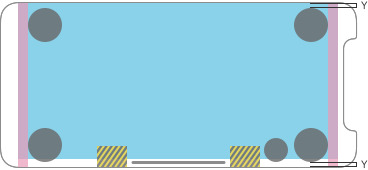
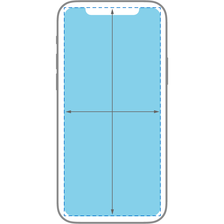
Inset essential content to prevent clipping. In general, content should be centered and symmetrically inset so it looks great in any orientation, isn’t clipped by rounded corners, isn’t hidden by a sensor housing, and isn’t obscured by the indicator for accessing the Home screen. For best results, use standard, system-provided interface elements and Auto Layout to construct your interface and adhere to the system-defined layout guides and safe areas. When the device is in landscape orientation, it may be appropriate for some apps — like games — to place tappable controls in the lower portion of the screen (extending below the safe area) to allow more room for content. Use matching insets when placing controls at the top and bottom of the screen, and leave ample space around the Home indicator so people don’t accidentally target it when trying to interact with a control. Because the Home indicator remains centered on the screen, its location relative to your app’s interface may change.
클리핑을 방지하기 위한 필수 콘텐츠를 포함합니다. 일반적으로 콘텐츠는 중앙에 대칭적으로 삽입되어야 하며 모든 방향에서 보기 좋고 모서리가 둥글게 잘리지 않으며 센서 하우징에 가려지지 않으며 홈 스크린에 액세스하기 위한 표시기에 가려지지 않아야 합니다. 최상의 결과를 얻으려면 표준 시스템 제공 인터페이스 요소 및 자동 레이아웃을 사용하여 인터페이스를 구성하고 시스템 정의 레이아웃 가이드 및 안전 영역을 준수하십시오. 장치가 가로 방향인 경우 게임과 같은 일부 앱에서는 콘텐츠를 저장할 수 있는 공간을 확보하기 위해 화면 하단(안전 영역 아래까지 확장)에 탭이 가능한 컨트롤을 배치하는 것이 적절할 수 있습니다. 화면 상단과 하단에 컨트롤을 배치할 때는 일치하는 삽입물을 사용하고, 사용자가 컨트롤과 상호 작용할 때 실수로 대상이 되지 않도록 Home 표시기 주위에 충분한 공간을 두십시오. Home(홈) 표시기는 화면 중앙에 있으므로 앱 인터페이스에 대한 위치가 변경될 수 있습니다.


Inset full-width buttons. A button that extends to the edges of the screen might not look like a button. Respect the standard system-defined margins on the sides of full-width buttons. A full-width button appearing at the bottom of the screen looks best when it has rounded corners and is aligned with the bottom of the safe area — which also ensures that it doesn’t conflict with the Home indicator.
전체 너비 버튼을 포함합니다. 화면 가장자리까지 확장되는 버튼은 버튼처럼 보이지 않을 수 있습니다. 전체 너비 버튼 측면의 표준 시스템 정의 여백을 준수합니다. 화면 하단에 나타나는 전체 너비 버튼은 모서리가 둥글고 안전 영역의 하단에 정렬되어 있을 때 가장 잘 나타나며, 홈 표시기와 충돌하지 않도록 합니다.
Don’t mask or call special attention to key display features. Don’t attempt to hide a device’s rounded corners, sensor housing, or indicator for accessing the Home screen by placing black bars at the top and bottom of the screen. Don’t use visual adornments like brackets, bezels, shapes, or instructional text to call special attention to these areas, either.
주요 디스플레이 기능을 숨기거나 특별한 주의를 환기하지 마십시오. 화면의 상단 및 하단에 검은색 막대를 배치하여 장치의 둥근 모서리, 센서 하우징 또는 홈 스크린에 액세스하기 위한 표시기를 숨기려 하지 마십시오. 괄호, 베젤, 도형, 또는 지시문과 같은 시각적 장식도 이러한 부분에 특별한 주의를 환기시키기 위해 사용하지 마세요.
Be mindful of the status bar height. The status bar is taller on full-screen iPhone models than on other models. If your app assumes a fixed status bar height for positioning content below the status bar, you must update your app to dynamically position content based on the current device. Note that the status bar on a full-screen iPhone doesn’t change height when background tasks like voice recording and location tracking are active.
상태 표시줄 높이에 주의하십시오. 상태 표시줄은 다른 모델보다 전체 화면 iPhone 모델에서 더 높습니다. 앱이 상태 표시줄 아래에 콘텐츠를 배치하기 위해 고정된 상태 표시줄 높이를 가정할 경우 현재 장치를 기반으로 콘텐츠를 동적으로 배치하도록 앱을 업데이트해야 합니다. 전체 화면 iPhone의 상태 표시줄은 음성 녹음 및 위치 추적과 같은 백그라운드 작업이 활성 상태일 때 높이가 변경되지 않습니다.
If you currently hide the status bar, reconsider that decision when your app runs on a full-screen iPhone. Full-screen iPhone models have more vertical space for content than other models, and the status bar occupies an area of the screen your app probably won’t fully utilize. The status bar also displays information people find useful. It should only be hidden in exchange for added value.
현재 상태 표시줄을 숨긴 경우, 앱이 전체 화면 iPhone에서 실행될 때 이 결정을 재고하십시오. 전체 화면 iPhone 모델은 다른 모델보다 콘텐츠를 저장할 수 있는 수직 공간이 더 많으며 상태 표시줄은 앱이 충분히 활용하지 못할 화면 영역을 차지합니다. 또한 상태 표시줄에는 사용자가 유용하다고 생각하는 정보가 표시됩니다. 그것은 부가 가치의 대가로만 숨겨져야 합니다.
Allow auto-hiding of the indicator for accessing the Home screen sparingly. When auto-hiding is enabled, the indicator fades out if the user hasn’t touched the screen for a few seconds. It reappears when people touch the screen again. This behavior should be enabled only for passive viewing experiences like playing videos or photo slideshows.
홈 스크린에 액세스하기 위해 표시기의 자동 숨기기를 허용합니다. 자동 숨기기가 활성화된 경우 사용자가 몇 초 동안 화면을 터치하지 않으면 표시기가 페이드 아웃됩니다. 사람들이 화면을 다시 터치하면 다시 나타납니다. 이 동작은 동영상 재생 또는 사진 슬라이드 쇼와 같은 수동적인 보기 환경에서만 활성화되어야 합니다.
Additional Layout Considerations
추가 배치 고려 사항입니다.
Make sure your website looks great on an edge-to-edge display. See Designing Websites for iPhone X on webkit.org.
웹 사이트가 가장자리 간 디스플레이에 잘 나타나는지 확인하십시오. webkit.org에서 iPhone X용 웹 사이트 디자인을 참조하십시오.
※ 참고 출처
Adaptivity and Layout - Visual Design - iOS - Human Interface Guidelines - Apple Developer
Adaptivity and Layout People generally want to be able to use their favorite apps on all of their devices and in any context. To meet this expectation, design an adaptable interface by configuring UI elements and layouts to automatically change shape and s
developer.apple.com
'HIG' 카테고리의 다른 글
| [iOS / HIG] Search Bars (0) | 2022.02.05 |
|---|---|
| [iOS / HIG] Navigation Bars (0) | 2022.02.05 |
| [iOS / HIG] App Icon (0) | 2022.02.05 |
| [iOS / HIG] Image Size and Resolution (0) | 2022.02.05 |
| [iOS / HIG] Navigation (0) | 2022.02.04 |