Tab Bars
A tab bar appears at the bottom of a screen, helping people understand the types of information or functionality an app provides. Tabs let people quickly switch between top-level sections in your app while preserving the current navigation state within each section.
화면 하단에 탭 표시줄이 나타나 앱이 제공하는 정보 또는 기능의 유형을 쉽게 이해할 수 있도록 도와줍니다. 탭을 사용하면 각 섹션의 현재 탐색 상태를 유지하면서 앱에서 최상위 섹션으로 빠르게 전환할 수 있습니다.
By default, a tab bar is translucent: It uses a background material only when content appears behind it, removing the material when the view scrolls to the bottom. A tab bar hides when a keyboard is onscreen.
기본적으로 탭 막대는 반투명합니다. 뒤에 콘텐츠가 나타날 때만 배경 소재를 사용하고, 뷰가 아래로 스크롤되면 소재를 제거합니다. 키보드가 화면에 있으면 탭 표시줄이 숨겨집니다.
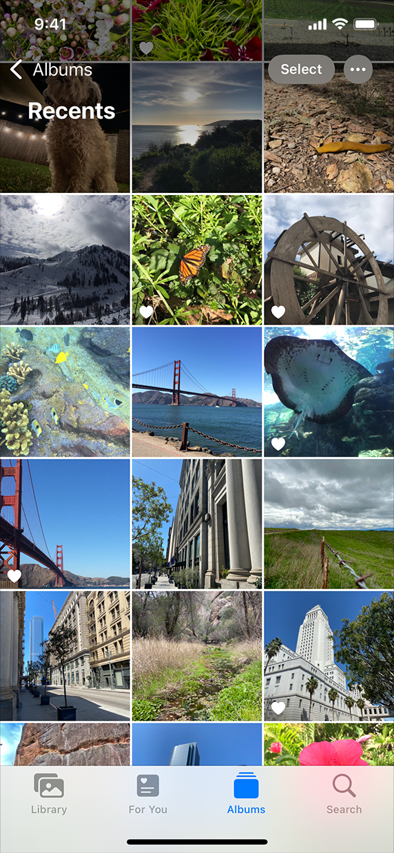
The Photos tab bar uses a background material to distinguish itself while letting underlapping content show through.
사진 탭 표시줄은 배경 재료를 사용하여 콘텐츠를 언더랩하면서 자신을 구별합니다.
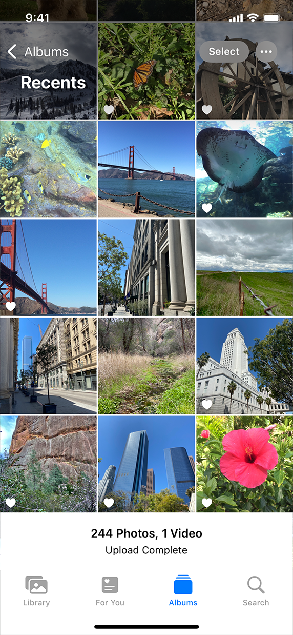
When no content appears behind the tab bar, the background material doesn’t appear.
탭 표시줄 뒤에 내용이 나타나지 않으면 배경 자료가 나타나지 않습니다.
Depending on device size and orientation, the number of visible tabs can be smaller than the total number of tabs. If horizontal space limits the number of visible tabs, the trailing tab becomes a More tab, revealing the remaining items in a list on a separate screen.
장치 크기 및 방향에 따라 표시되는 탭 수가 전체 탭 수보다 적을 수 있습니다. 수평 공백으로 표시되는 탭 수가 제한되면 추적 탭이 추가 탭이 되어 목록의 나머지 항목이 별도의 화면에 표시됩니다.
For developer guidance, see UITabBar.
개발자 지침은 UITAbBar를 참조하십시오.
TIP
Although tab bars and toolbars both appear at the bottom of a screen, each has a different purpose. A tab bar lets people navigate among different areas of an app, such as the Alarm, Stopwatch, and Timer tabs in the Clock app. A toolbar contains buttons for performing actions related to the screen, such as creating an item, filtering items, or marking up content. Tab bars and toolbars don’t appear together in the same view.
탭 표시줄과 도구 모음은 모두 화면 하단에 나타나지만, 각각 용도는 다릅니다. 탭 표시줄을 통해 사람들은 시계 앱의 알람, 스톱워치, 타이머 탭과 같은 앱의 여러 영역을 탐색할 수 있습니다. 도구 모음에는 항목 만들기, 항목 필터링 또는 내용 표시와 같은 화면 관련 작업을 수행하기 위한 버튼이 있습니다. 탭 표시줄과 도구줄은 동일한 보기에 함께 나타나지 않습니다.
Use a tab bar only to enable navigation, not to help people perform actions. If you need to provide controls that act on elements in the current view, use a toolbar instead.
탭 표시줄은 네비게이션을 사용 가능으로 설정할 때만 사용하고, 다른 사용자의 작업 수행에는 도움이 되지 않습니다. 현재 뷰의 요소에 작용하는 컨트롤을 제공해야 하는 경우 도구 모음을 대신 사용합니다.
Use the minimum number of tabs required to clarify your information hierarchy and help people navigate your app. Too many tabs reduce the tappable area of each tab and might increase the complexity of your interface. Too few tabs can lead to categories or modes that are too broad to be useful, requiring people to select a tab to find out what it contains. Although a More tab displays additional tabs, it requires an extra tap to reveal them and can be a poor use of space. In general, use three to five tabs on iPhone; use a few more on iPad if necessary.
정보 계층을 명확히 하고 사람들이 내 앱을 탐색하는 데 필요한 최소한의 탭 수를 사용합니다. 탭이 너무 많으면 각 탭의 탭 가능 영역이 줄어들고 인터페이스의 복잡성이 증가할 수 있습니다. 탭이 너무 적으면 범주나 모드가 너무 넓어 유용하지 못할 수 있으므로, 탭을 선택하여 무엇이 포함되는지 확인해야 합니다. 추가 탭에는 추가 탭이 표시되지만 탭을 표시하려면 탭을 추가로 눌러야 하므로 공간을 제대로 사용하지 못할 수 있습니다. 일반적으로 iPhone에서는 3개에서 5개의 탭을 사용하고, 필요한 경우 iPad에서 몇 개 더 사용합니다.
In an iPadOS app, consider using a sidebar instead of a tab bar. Because a sidebar can display a large number of items, it can make navigating an iPad app more efficient. You can also let people customize a sidebar’s items and let them hide it to make more room for content. For guidance, see Sidebars.
iPadOS 앱에서는 탭 표시줄 대신 사이드바를 사용하는 것이 좋습니다. 사이드바는 많은 항목을 표시할 수 있기 때문에 iPad 앱을 보다 효율적으로 탐색할 수 있습니다. 또한 사용자가 사이드바의 항목을 사용자 정의하고 사이드바를 숨기도록 하여 내용을 저장할 공간을 늘릴 수 있습니다. 자세한 내용은 사이드바를 참조하십시오.
Avoid hiding the tab bar when people navigate to different areas in your app. The tab bar is a global navigation control for your app, so make sure it’s always visible. The exception is a tab bar within a modal view. Because a modal view gives people a separate experience that they dismiss when they’re finished, hiding the view’s tab bar doesn’t affect app navigation.
사람들이 앱에서 다른 영역으로 이동할 때 tab bar을 숨기지 않도록 합니다. 탭 모음은 앱의 global navigation control이므로 항상 표시되도록 하십시오. 모달 뷰 내의 tab bar는 예외입니다. 모달 뷰는 완료되었을 때 해제하는 별도의 경험을 제공하므로 보기의 탭 표시줄을 숨기더라도 앱 탐색에 영향을 미치지 않습니다.
Avoid removing or disabling a tab when its content is unavailable. If tabs are enabled in some cases but not in others, your app’s interface might appear unstable and unpredictable. When necessary, explain why a tab’s content is unavailable. For example, even when there is no music on an iOS device, the Listen Now tab in the Music app remains available and offers suggestions for downloading music.
내용을 사용할 수 없을 때는 탭을 제거하거나 사용하지 않도록 설정하지 마십시오. 탭이 활성화된 경우도 있지만 다른 경우에는 활성화되지 않은 경우 앱 인터페이스가 불안정하고 예측 불가능하게 나타날 수 있습니다. 필요한 경우 탭의 내용을 사용할 수 없는 이유를 설명합니다. 예를 들어, iOS 기기에 음악이 없는 경우에도 음악 앱의 지금 듣기 탭은 계속 사용 가능하고 음악 다운로드에 대한 제안사항을 제공합니다.
Ensure that tabs affect the view that’s attached to the tab bar, not views elsewhere onscreen. For example, selecting a tab on the left side of a split view shouldn’t cause the right side of the split view to change. Similarly, selecting a tab in a popover shouldn’t change a view behind the popover.
탭이 화면의 다른 보기가 아니라 탭 표시줄에 부착된 보기에 영향을 미치는지 확인합니다. 예를 들어 분할 뷰의 왼쪽에 있는 탭을 선택해도 split view의 오른쪽이 변경되지 않아야 합니다. 마찬가지로, 팝업에서 탭을 선택해도 팝업 뒤의 보기가 변경되지 않습니다.
Use a badge to communicate unobtrusively. You can display a badge — a red oval containing white text and either a number or an exclamation point — on a tab to indicate that new information associated with that view or mode is available. For developer guidance, see UITabBarItem.
방해받지 않고 소통하려면 배지를 사용하세요. 흰색 텍스트와 숫자 또는 느낌표가 포함된 빨간색 타원형 배지를 탭에 표시하여 해당 보기 또는 모드와 관련된 새 정보를 사용할 수 있음을 나타낼 수 있습니다. 개발자 지침은 UITAbBarItem을 참조하십시오.
Consider using SF symbols to provide scalable, visually consistent tab bar items. When you use SF symbols, tab bar items automatically adapt to different contexts. For example, the tab bar can be regular or compact, depending on the current device and orientation. Also, tab bar glyphs can appear above tab titles in portrait orientation, whereas in landscape, the glyphs and titles can appear side by side. Prefer filled symbols or glyphs for consistency with the platform. If your app uses a sidebar instead of a tab bar when it runs on iPad, switch the filled symbols or glyphs to the outlined variant in the sidebar. For guidance, see SF Symbols.
SF 기호를 사용하여 확장 가능하고 시각적으로 일관된 탭 모음 항목을 제공하는 것을 고려해 보십시오. SF 기호를 사용하면 탭 모음 항목이 자동으로 다른 컨텍스트에 적응합니다. 예를 들어 탭 모음은 현재 장치와 방향에 따라 일반 또는 소형일 수 있습니다. 또한 세로 방향에서는 탭 제목 위에 탭 막대 문자가 나타날 수 있지만 가로 방향에서는 문자와 제목이 나란히 나타날 수 있습니다. 플랫폼과의 일관성을 위해 채워진 기호 또는 글리프를 선호합니다. iPad에서 실행될 때 앱이 탭 모음 대신 사이드바를 사용하는 경우 채워진 기호 또는 글리프를 사이드바의 간략한 변형으로 전환합니다. 자세한 내용은 SF 기호를 참조하십시오.
If you need to create custom tab bar glyphs, create each glyph in two sizes so that the tab bar looks good in both regular and compact environments. Use the following metrics when creating tab bar glyphs in different shapes. For guidance, see Glyphs.
사용자 정의 탭 막대 글리프를 만들어야 하는 경우 일반 환경과 소형 환경 모두에서 탭 막대가 잘 보이도록 각 글리프를 두 가지 크기로 만듭니다. 다른 모양의 탭 막대 글리프를 생성할 때 다음 메트릭을 사용합니다. 자세한 내용은 글리프를 참조하십시오.
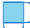
Target width and height (circular glyphs)
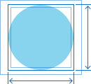
Regular tab barsCompact tab bars
| 25x25 pt (75x75 px @3x) | 18x18 pt (54x54 px @3x) |
| 25x25 pt (50x50px @2x) | 18x18 pt (36x36 px @2x) |
Target width and height (square glyphs)
Regular tab barsCompact tab bars
| 23x23 pt (69x69 px @3x) | 17x17 pt (51x51 px @3x) |
| 23x23 pt (46x46 px @2x) | 17x17 pt (34x34 px @2x) |
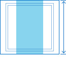
Target width (wide glyphs)
Regular tab barsCompact tab bars
| 31pt (93px @3x) | 23pt (69px @3x) |
| 31pt (62px @2x) | 23pt (46px @2x) |
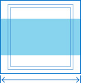
Target height (tall glyphs)
Regular tab barsCompact tab bars
| 28pt (84px @3x) | 20pt (60px @3x) |
| 28pt (56px @2x) | 20pt (40px @2x) |
※ 참고 출처
Tab Bars - Bars - iOS - Human Interface Guidelines - Apple Developer
Tab Bars A tab bar appears at the bottom of a screen, helping people understand the types of information or functionality an app provides. Tabs let people quickly switch between top-level sections in your app while preserving the current navigation state w
developer.apple.com
'HIG' 카테고리의 다른 글
| [iOS / HIG] Image Views (0) | 2022.02.05 |
|---|---|
| [iOS / HIG] Collections (0) | 2022.02.05 |
| [iOS / HIG] Status Bars (0) | 2022.02.05 |
| [iOS / HIG] Search Bars (0) | 2022.02.05 |
| [iOS / HIG] Navigation Bars (0) | 2022.02.05 |